The most attractive logo on a presentation slide may fail the moment it reaches a hoodie, cap, woven label, or embroidered chest. Clothing logo design ideas only become useful when they survive the garment test: the mark must fit the audience, garment type, placement, production method, color system, and operating model behind the merch program.
A creator drop can tolerate a more expressive logo than an enterprise onboarding program, where the same identity may need to work across many products and departments. A detailed design can look excellent in a large direct-to-garment print yet collapse in embroidery. A colorful screen version may need a one-color alternative for labels, sleeves, and small digital placements.
The ten directions below treat each logo as a merch system, not a screen-only asset. Every entry includes a practical use case, color and placement guidance, an AI-ready prompt line, and production or brand-safety checks. FLYP is one option for turning brand inputs into garment-accurate designs across 600+ premium blanks, with review and fulfillment considerations for larger programs. Teams managing many approved color variations can also use a batch processing logo color updates workflow to keep a broader merch library consistent.
Table of Contents
- 1. Minimalist Brand Mark with Monogram
- 2. Dynamic Wordmark with Custom Typography
- 3. Icon-Based Logo System
- 4. Geometric Abstract Logo
- 5. Mascot or Character Logo
- 6. Badge or Emblem Logo Design
- 7. Gradient and Color-Shift Logo
- 8. Typographic Logo with Integrated Icon
- 9. Minimalist Line Art Logo
- 10. Illustrated or Pictorial Logo
- 10 Clothing Logo Styles Comparison
- Turn One Logo Idea Into a Reliable Merch System
1. Minimalist Brand Mark with Monogram
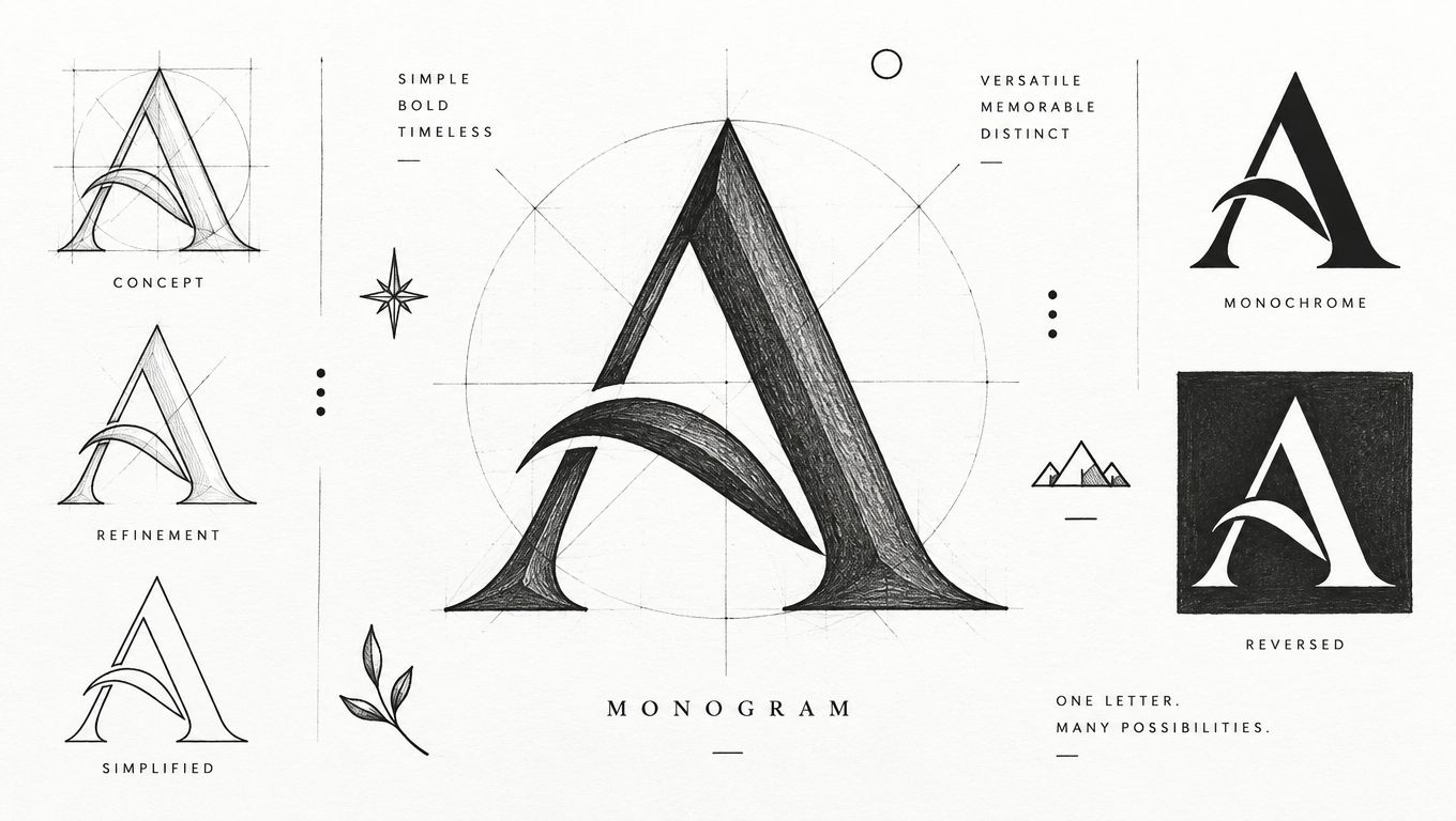
A monogram or abstract single-letter mark earns its place when people need to recognize the brand quickly and repeatedly. Nike's Swoosh, Apple's apple, Google's “G,” and Amazon's arrow show how a compact symbol can carry identity without reproducing the full company name. Fashion has used the same logic for decades. The Louis Vuitton monogram was introduced in 1896 as an anti-counterfeiting measure, while Chanel's interlocking C mark, created in 1925, has remained unchanged since then, as documented by this history of fashion logos.
For enterprise swag, keep the geometry uncomplicated. Test the mark at a small embroidery size, then create a monochrome version before exploring color. Chest placement is dependable for employee apparel, sleeve placement works for understated recognition pieces, and a larger back application gives the mark room to become the main visual on event merchandise.
Build the mark for repeatable production
Use a prompt such as: “Create a refined geometric monogram based on the letter A, single-color vector mark, balanced negative space, bold silhouette, suitable for chest embroidery and sleeve print, no gradients, no mockup.”
Production rule: If the mark needs a long explanation after it's reduced, it's too complex for dependable merch.
Document the approved scale, clearance, thread or ink colors, and placement coordinates. For teams comparing methods, this guide to embroidery versus print for company apparel helps frame the trade-off between tactile durability and fine visual detail. Confirm that the design is original and that any letterform treatment doesn't create confusion with an existing mark.
2. Dynamic Wordmark with Custom Typography
A wordmark puts the brand name directly on the garment, which makes it useful when recognition is still developing or when the name itself has cultural value. Coca-Cola's script, Google's wordmark, Uber's typographic system, and Stripe's typography demonstrate how letterforms can communicate tone before a viewer understands the wider brand system.
The trade-off is space. A wordmark needs enough width to remain readable, especially in embroidery, where tight counters and delicate joins can close up. Create a full version for the back or front of a shirt, a condensed version for a sleeve or hat, and a short-name or initials version for small applications. Test the design on both dark and light fabrics, because a color choice that works on a screen may lose contrast against heathered or textured material.
Give typography a garment-specific version
An AI-ready prompt could read: “Design a custom athletic wordmark for [brand name], confident condensed lettering, open counters, strong spacing, one-color vector artwork, optimized for embroidery and screen print, no background.”
Use kerning deliberately. Embroidery often needs more breathing room than print, while a large screen print can support more expressive letter relationships. A custom T-shirt design software workflow can help teams test variations against actual garment placements instead of judging the wordmark only on a white artboard.
For limited releases, a wordmark can carry the event name, date, or campaign phrase. Keep those additions separate from the core identity so the main logo remains reusable. Before launch, check whether the word element and distinctive lettering are clear for commercial use, particularly when the apparel range includes headwear and accessories. Designers comparing type discovery tools may also find this guide to top logo font finders for 2026 useful during exploration.
3. Icon-Based Logo System
An icon becomes more valuable when it's part of a documented visual language rather than a lone decorative symbol. Microsoft Fluent, Google Material icons, Apple SF Symbols, and IBM's design language show how a core visual vocabulary can support many applications without making every asset identical.
That flexibility suits enterprise merch programs with separate departments, regions, events, or employee communities. Start with a primary icon, then define supporting symbols, pattern rules, color roles, and combinations. A marketing team might use the core icon alone on a cap, while a conference shirt combines it with an event symbol and a short wordmark.
Design the library before the collection
Create print-specific and embroidery-specific variants. Screen print can accommodate finer interior details than a small stitched mark, while direct-to-garment printing may preserve color transitions that require simplification for screen separation. Document which icons may appear together, how much space they need, and which combinations are reserved for internal programs.
Use this AI prompt line: “Create a modular icon family for [brand], one primary geometric symbol plus complementary simplified icons, consistent stroke weight, monochrome and two-color versions, designed for apparel patches, embroidery, screen print, and social avatars.”
The system needs visual balance across garments. A dense icon next to a light one can make a chest lockup feel lopsided, even if both assets look fine independently. Test combinations on shirts, jackets, totes, and hats before approving the library. Keep ownership records for generated and edited assets, preserve the source files, and establish prohibited uses so local teams can't remix the identity into an unapproved symbol set.
4. Geometric Abstract Logo
Geometric marks use circles, triangles, squares, hexagons, and negative space to create an identity without relying on literal imagery. Airbnb's “A,” Dropbox's box mark, Slack's constructed symbol, and the geometric logic associated with GitHub's Octocat inspiration show how simple forms can become distinctive through proportion and arrangement.
This direction works well for a contemporary merch drop because the same geometry can expand into patterns, labels, woven patches, and garment panels. It also gives production teams clean edges and predictable shapes. The risk is sameness. A circle plus a cutout may look polished but fail to distinguish the brand from other technology, lifestyle, or streetwear identities.
Make the geometry earn its place
Try a prompt such as: “Create an abstract geometric apparel logo using interlocking hexagons and deliberate negative space, modern but distinctive, one-color and two-color vector versions, clean edges, embroidery-safe, suitable for a left chest and woven label.”
Evaluate the mark in black and white before approving the color version. A geometric logo that depends on subtle color contrast may disappear on dark fabric, while a strong monochrome silhouette can travel across nearly any garment. Angled construction can translate cleanly into stitching, but tiny internal gaps still need testing on the intended material.
Use a primary mark, a pattern tile, and a simplified micro mark rather than forcing one composition everywhere. Place the full symbol on the back of a heavyweight sweatshirt, the micro mark on a cap, and the repeat pattern inside packaging or on a label. Run a trademark search before production, especially if the geometry resembles a familiar industry symbol.
5. Mascot or Character Logo
A mascot gives the merch a face, which can make an organization feel more approachable than a purely corporate wordmark. Mailchimp's Freddie, Duolingo's owl, Slackbot, and GitHub's Octocat demonstrate how a character can support recognition, humor, and campaign storytelling across a wider identity system.
The garment challenge is detail. Fur, facial features, gradients, and tiny accessories may look lively in a poster but become muddy in embroidery or a small sleeve print. Start with a strong silhouette and a limited facial treatment. Then create an expression library for events, recognition moments, seasonal campaigns, or community drops. Each expression should share the same head shape, proportions, and distinctive features.
Separate the hero illustration from the stitch file
Use an AI prompt like: “Create a friendly fox mascot for [brand], bold simplified silhouette, clear face, limited flat colors, three expressive poses, embroidery-ready outline, no text, no complex background.”
A full-color character can serve as the hero artwork for direct-to-garment printing. A two-tone or outline version should handle caps, patches, and small placements. Sleeve use demands particular care because viewers see the design at an angle and from a distance. Test the mascot on the actual fabric, not only in a digital mockup.
The opening image below shows the kind of expression exploration that can help establish a consistent character language.
A mascot also carries brand-safety risk. Check that the generated character doesn't unintentionally imitate a known property, recognizable costume, or protected character style. Keep a human review step for every final pose, especially when the design will appear on public-facing event apparel.
Mascot motion can work for digital launch assets, but the garment version still needs a stable, recognizable anchor.
6. Badge or Emblem Logo Design
Badges and emblems suit brands that want to signal heritage, authority, craftsmanship, or membership. A shield, crest, or circular seal naturally occupies the chest, cap front, jacket back, and patch format. Outdoor and heritage apparel often benefits from this structure because the border creates a contained unit that feels finished on fabric.
The same containment can create clutter. Interior text, dates, icons, borders, and decorative lines compete for limited space, particularly in embroidery. Keep the main version focused on a few essential components, then remove secondary details for small applications. A premium onboarding kit might use the full emblem on a jacket and a simplified shield on a cap or notebook.
Control the hierarchy inside the badge
Prompt direction: “Design a heritage-inspired circular apparel badge for [brand], central mountain symbol, bold outer ring, clear short wordmark, limited colors, strong negative space, embroidery-ready at chest scale, no fine filigree.”
Use a high-contrast palette that separates the border, icon, and text. Avoid relying on several close shades that will merge in thread. Define the badge diameter for each garment category and create a patch-ready file with a clean outer edge. Embroidery may require a structured border or backing so the patch retains its shape, while direct print can reproduce more delicate internal lines.
A crest can also become too formal for a playful audience. Match the ornament level to the brand's actual behavior. If the organization is modern and informal, a restrained circular seal may work better than a detailed shield. Review the name, icon, and any symbols for trademark and cultural concerns before production, then store approved and simplified versions in one controlled asset library.
7. Gradient and Color-Shift Logo
Gradients create energy and depth, making them attractive for creator merchandise, entertainment communities, and digital-first brands. Instagram and Spotify have shown how color transitions can become recognizable parts of an identity, but apparel introduces limitations that a screen preview doesn't reveal.
A gradient printed with direct-to-garment technology may retain a smooth transition, while screen printing usually requires separated colors and careful registration. Embroidery is a different proposition altogether. Thread can approximate a color shift through stepped areas, but a simple solid-color mark is usually more reliable for small stitching, woven labels, and repeat production.
Treat the gradient as a premium version
Use this prompt: “Create a vibrant abstract logo with a controlled purple-to-orange gradient, bold flat silhouette, strong monochrome fallback, clean vector edges, suitable for direct-to-garment apparel and simplified screen-print separation.”
Build the solid-color version first. If the mark only works with its gradient, the system lacks a dependable production foundation. Test the transition on black, white, and mid-tone garments because fabric color changes the perceived brightness and can weaken the contrast.
For a creator drop, reserve the gradient for a front graphic or larger back print, then use the solid mark on hats, sleeves, packaging, and labels. Color consistency needs documentation. Record the approved digital colors, print references, and substitution rules for suppliers. The 2025 apparel logo research linked here in the study of minimalist logo design reported that as many as 90.57% of consumers supported minimalist design, a useful reminder that visual energy shouldn't come at the expense of clarity.
8. Typographic Logo with Integrated Icon
A hybrid logo joins readable type with a small symbol that belongs to the lettering or lockup. LinkedIn's “in,” Firefox's wordmark relationship, Basecamp's visual identity, and Notion's integrated typography show how text and symbol can reinforce each other without becoming two unrelated assets.
This direction is strong for brand-forward collections where the name needs to remain visible but the design should have more character than plain type. The main trade-off is flexibility. If the icon is fused too tightly to the letters, it may be difficult to use on its own, embroider cleanly, or adapt to a narrow placement.
Design both unity and separation
Try: “Create a modern integrated wordmark for [brand], custom sans-serif lettering with a subtle icon built into one letter, clear counters, balanced spacing, one-color and separated icon versions, apparel-ready.”
Test the full lockup at actual chest scale, then test the icon and wordmark independently. The icon should enhance recognition rather than interrupt reading. On a shirt, the full lockup can sit across the front, while the icon alone can move to a sleeve, hat, or woven label.
Define clear space around both components and specify whether the icon may change color independently. Avoid visual tricks that disappear in embroidery. A small notch, overlap, or interior counter needs enough physical room to survive thread and fabric movement. Review the final design for accidental resemblance to existing marks, especially when a common letter is paired with a familiar symbol.
9. Minimalist Line Art Logo
Line art gives a brand a refined, editorial, or modern tone through outline rather than fill. The approach can work beautifully on natural fabrics, premium blanks, and understated lifestyle collections. It's also easy to recolor because the mark typically relies on one solid ink or thread color.
Thin lines create the main production risk. A line that reads elegantly on a large digital canvas may break, fill, or vanish when embroidered. Fabric texture adds another variable, particularly on fleece, canvas, and ribbed materials. Keep the line weight consistent in the master artwork, but don't assume the same file should be sent unchanged to every decoration method.
Preserve the negative space
Prompt line: “Create a minimalist single-line outline logo of [subject], consistent medium-weight stroke, generous negative space, one-color vector artwork, no shading, suitable for screen print, woven label, and simplified embroidery.”
A small mark needs breathing room around the outside as well as between internal lines. Use the line-art version for a clean front chest or label, then create a filled silhouette for a hat or small embroidery placement. A practical small-scale test is the [0.5-inch embroidery version], but production approval should still depend on the actual machine, fabric, and thread behavior rather than the nominal size alone.
Line art can also disappear on low-contrast garments. Specify approved background colors and a reversed version for dark fabric. The independent consumer-identity study found that 72.6% of respondents recognized a brand from color or design alone, while logos and colors were the leading quick visual cues at 29.5% and 26.3%, respectively, according to the published identity study. Consistent geometry and color matter more than adding decorative detail.
10. Illustrated or Pictorial Logo
An illustrated logo depicts a recognizable object, scene, or concept and gives the brand room for storytelling. Lacoste's crocodile, Twitter's bird, Pringles' Mr. P, and Mastercard's overlapping-circle illustration show how a pictorial asset can become a shorthand for a larger identity.
Illustration works especially well for creative communities, outdoor concepts, food brands, and design-led collections. It can also become expensive or inconsistent when every placement needs a different redraw. Create a hero illustration for large print, a reduced line-work version for embroidery, and a simplified silhouette for labels and small accessories. Keep the subject recognizable after details are removed.
Build a family of usable files
Prompt example: “Create a hand-drawn pictorial logo of a vintage mountain radio, distinctive silhouette, limited flat colors, clean contour version for embroidery, detailed version for large direct-to-garment print, no background, no text.”
Test the artwork on light, dark, textured, and heathered garments. A line-work file may need a contrasting underlay or stronger outline on dark fabric. Large prints can support richer storytelling, while a chest mark should focus on the object's most recognizable contour.
Create placement-specific variations instead of shrinking the hero file until it becomes illegible. An apparel mockup generator can help compare the illustration on different garment types and positions before sampling. Retain editable source files and document the rights for any reference images, generated elements, typefaces, or commissioned artwork. If the subject resembles a protected character, logo, mascot, or distinctive commercial illustration, stop for a rights review before turning it into merch.
10 Clothing Logo Styles Comparison
| Logo Style | Implementation Complexity 🔄 | Resource Requirements ⚡ | Expected Outcomes ⭐ | Ideal Use Cases 📊 | Quick Tip 💡 |
|---|---|---|---|---|---|
| Minimalist Brand Mark with Monogram | Low 🔄, simple, single glyph | Low ⚡, few colors, easy production | ⭐⭐⭐⭐⭐ Strong recall & highly scalable | Enterprise swag, onboarding kits | Test at 1" embroidery; provide monochrome version |
| Dynamic Wordmark with Custom Typography | Medium 🔄, custom letterforms needed | Medium ⚡, type design + licensing | ⭐⭐⭐⭐ Clear identity communication | Brand-focused merch, event drops | Ensure ≥2" embroidery width; test contrast |
| Icon-Based Logo System | High 🔄, modular system design | High ⚡, icon library & governance | ⭐⭐⭐⭐⭐ Cohesive, extensible across SKUs | Enterprise & multi-department programs | Build comprehensive icon library and guidelines |
| Geometric Abstract Logo | Low–Medium 🔄, shape-driven rules | Low ⚡, simple shapes, easy reproduction | ⭐⭐⭐⭐ Scalable, modern aesthetic | Startups, scaleup onboarding kits | Use 45° angles for embroidery; test color variants |
| Mascot or Character Logo | High 🔄, character design + expressions | High ⚡, illustration, pose libraries | ⭐⭐⭐⭐⭐ High engagement & emotional appeal | Social, event drops, employee engagement | Simplify silhouette for embroidery; create expression set |
| Badge or Emblem Logo Design | Medium–High 🔄, layered composition | Medium–High ⚡, more thread/colors | ⭐⭐⭐⭐ Premium perception & craftsmanship | Outdoor/heritage brands, premium recognition | Limit interior elements to 3–4; provide simplified version |
| Gradient and Color-Shift Logo | Medium 🔄, color workflows & transitions | Medium ⚡, DTG/color testing preferred | ⭐⭐⭐ High digital impact; limited for embroidery | Digital-first brands, limited-edition drops | Make a solid-color master; test gradients on fabric |
| Typographic Logo with Integrated Icon | Medium 🔄, balance text + mark | Medium ⚡, type tweaks + icon integration | ⭐⭐⭐⭐ Distinctive while retaining name clarity | Brand-forward merchandise & enterprise uses | Create separable icon/text versions; test legibility |
| Minimalist Line Art Logo | Low 🔄, precise line construction | Low ⚡, minimal production complexity | ⭐⭐⭐ Elegant, production-efficient but subtler | Minimalist brands, mass merch across blanks | Keep consistent line weight; test at 0.5" embroidery |
| Illustrated or Pictorial Logo | High 🔄, detailed illustration work | High ⚡, skilled artists & color separations | ⭐⭐⭐⭐ Highly distinctive story-driven mark | Creative drops, design-forward enterprises | Provide simplified embroidery/line versions for production |
Turn One Logo Idea Into a Reliable Merch System
Choosing a direction is only the creative midpoint. The useful question is whether the logo can become a controlled set of files, colors, placements, and production rules that different people can use without weakening the identity.
Start by matching the concept to the audience and use case. A monogram may suit employee recognition and repeat enterprise apparel, while a mascot can create more energy for an event or community drop. A badge can signal heritage, but it may feel too formal for an informal creator audience. A gradient can energize a large front print, yet a solid-color fallback will still be needed for embroidery and small labels.
Then create variants deliberately. At minimum, define a primary logo, a simplified mark, a monochrome version, a reversed version for dark garments, and placement-specific lockups. A detailed illustration shouldn't be forced into a hat file, and a wide wordmark shouldn't be squeezed into a sleeve space. Store each approved asset with clear naming, usage notes, and ownership information.
Color and placement need the same discipline. Specify approved garment colors, ink or thread substitutions, background contrast requirements, minimum clear space, and the locations where the mark may appear. Test embroidery and print legibility on the actual blanks you intend to sell or distribute. A design that works on smooth cotton may behave differently on fleece, canvas, rib knit, or textured headwear.
Before launch, document licensing, originality, trademark clearance, prohibited uses, and approval ownership. Trademark review should cover both words and design elements, particularly when the program includes apparel, headwear, and accessories. Research on clothing labels indicates that logo-focused approaches account for about 45.2% of global label design approaches and represent approximately $2.24B within a 2025 clothing labels market estimated at $4.94B, as reported by the clothing labels market analysis. The commercial lesson is practical: logo files need to work in labels and broader product systems, not just campaign graphics.
Run a small pilot across representative blanks before expanding a creator drop or enterprise program. Inspect physical samples for thread density, ink coverage, contrast, placement, shrinkage, and wash behavior. Collect approval from brand, legal, merchandising, and operations owners before opening distribution.
FLYP can support this workflow when teams need AI-generated variations, garment-accurate previews, curation, QA, logistics, reporting, and managed fulfillment. Its platform turns prompts, URLs, videos, images, or briefs into clothing designs across 600+ premium blanks, and it can support enterprise programs such as onboarding kits, recognition moments, event drops, and employee-choice stores. Visit FLYP for current platform details and to evaluate how the workflow fits your merch operation.
FLYP LTD helps creators and enterprise teams turn brand inputs into production-ready clothing designs, garment previews, curated collections, and managed fulfillment. Visit FLYP LTD to develop logo variants, test them on real merch placements, and move approved designs into a controlled apparel program.