The best shirt designs start with the moment, not the graphic. A striking illustration can help, but it won't rescue merch that ignores why someone is wearing it in the first place. A new hire wants something that feels like belonging, not leftover event swag. An attendee wants a shirt they'll wear after the conference. A creator's fan wants a signal to other fans, not a generic logo stamp.
That's why most galleries of t shirt design examples miss the decision. They sort by aesthetic trend instead of use-case. In practice, the shirt has to work inside a system: brand hierarchy, garment choice, decoration method, audience specificity, approval flow, and whether the piece needs to scale across regions or stay special for a small group.
That matters in a category this large. One industry summary reports t-shirt market revenue of $45.52 billion in 2024 and $46.99 billion in 2025, with some forecasts projecting $52.8 billion by 2029, while another estimate projects $30.68 billion in 2026 and $44.81 billion by 2035 according to Printful's t-shirt industry statistics. Teams don't need more inspiration boards. They need marketplace-ready shirt designs that hold up across production and real wear.
Here are eight approaches worth using, with the trade-offs that shape good merch.
Table of Contents
- 1. Minimalist Logo Design
- 2. Graphic Front Back Placement Design
- 3. Niche Community Subculture Design
- 4. All Over Print Design
- 5. Vintage Distressed Design
- 6. Collaborative Multi Brand Design
- 7. Data Driven Personalized Design
- 8. Sustainability Cause Driven Design
- 8 T-Shirt Design Styles Comparison
- Turn Inspiration Into a Repeatable Merch System
1. Minimalist Logo Design
Minimalist logo tees are easy to underestimate because they look simple. They only work when the brand already has enough recognition, or when the garment quality and placement carry the premium feel. A small Apple icon, a monochrome Google mark, or a Nike Swoosh can do that because the symbol itself is already legible and culturally familiar.
For enterprise programs, this is the safest option when the shirt needs broad wearability. New hires will wear it. Executives won't reject it. Teams in different regions can use the same asset without rewriting the design for local context. That's the strength.
Where it works best
Use minimalist logo shirts for onboarding kits, internal team uniforms, executive gifting, and employee-choice stores where you want the broadest acceptance. A left-chest mark or restrained back-neck placement keeps the shirt inside the wearer's normal wardrobe instead of forcing it into “promotional tee” territory.
The trade-off is memorability. If the only thing on the shirt is a weak logo on a cheap blank, the result feels disposable.
Practical rule: Minimal branding only feels premium when the blank, ink or thread, and placement all feel intentional.
A few execution habits help:
- Choose one priority placement: Left chest is the most wearable. Full center chest is louder and works better for public events than everyday employee wear.
- Match the decoration to the brand tone: Embroidery improves restrained marks. Print works better for flatter, cleaner symbols.
- Test across garment colors: A logo that looks sharp on black may disappear on heather gray or fight with a brand color.
- Protect negative space: Minimal designs lose value fast when extra taglines, URLs, or campaign copy get added.
There's also a useful historical reason this format keeps winning. Screen printing became commercially scalable after Michael Vasilantone's multicolor garment printing innovation in 1960 and his later patent filing, building on much older roots that trace back to Song Dynasty China and Samuel Simon's 1907 silk screen stencil patent in England as outlined in this history of t-shirt printing. Simple logo systems benefit from that history because they reproduce consistently at scale.
Best adaptation
If your brand isn't iconic enough for a pure logo shirt, don't force it. Add one small supporting element, such as a department wordmark, city lockup, or event year, and keep the rest restrained.
2. Graphic Front Back Placement Design
Front and back placement is the workhorse system for brands that need more storytelling without jumping into full streetwear mode. Stripe-style campaign copy on the back with a clean front mark, or Microsoft Teams event apparel with a restrained front and louder rear message, gives you two reading distances. One for close interaction, one for across-the-room visibility.
This is the layout I'd choose first for conferences, field marketing, summit staff uniforms, and launch campaigns. The front handles identity. The back handles meaning.
Here's a visual example of how placement can change the whole feel of a shirt:
Why this system scales
This format is production-friendly because it uses familiar print zones and doesn't ask too much from the garment. It also solves a common enterprise problem. Legal or brand teams often want clear identification, while events teams want energy. Splitting the hierarchy across front and back gives both sides room.
If you're iterating layouts digitally, an apparel mockup generator for garment placement testing helps catch issues before sampling, especially when you need to compare front-heavy versus back-heavy compositions across different blanks.
What fails here is clutter. Teams often treat the back as a dumping ground for hashtags, sponsor marks, campaign lines, and URLs. The result reads like a tote bag, not a shirt.
Front and back should feel connected, not separate files forced onto one garment.
A cleaner system usually looks like this:
- Front for identification: Brand mark, event insignia, or short title.
- Back for message: Campaign phrase, artwork, role labeling, or location story.
- Sleeves only if necessary: Add sleeve hits for staff, sponsors, or regional variants only when they serve a clear job.
Best adaptation
If the shirt needs to serve both staff and attendees, keep the front identical and change only the back line. That preserves brand consistency while letting each audience wear a version that fits their role.
3. Niche Community Subculture Design
Some of the strongest t shirt design examples look confusing to outsiders. That's usually a good sign. A developer tee with a language joke, a gym shirt that riffs on lifting culture, or a photography design built around aperture references works because the audience gets the signal immediately.
That recognition creates belonging faster than a broad lifestyle slogan ever will. For creators, this matters even more. Fans don't buy the shirt only because it looks good. They buy it because it proves they're inside the same language system.
The trade-off is shelf life
The tighter the reference, the stronger the emotional hit for the right audience. But the design can age quickly if it leans too hard on a short-lived meme or platform joke. A shirt tied to a niche identity lasts longer when the reference sits one layer deeper than trend chatter.
For example, a designer shirt built around kerning humor or a coder shirt referencing debugging pain tends to outlast a one-week meme because the underlying frustration or pride remains true.
Review discipline matters. Community shirts often move fast, and fast-moving teams tend to skip structured approvals. In one screen-printing process case study, adding a clearer design-approval policy and a PDF reference for printers reduced changeover time by 25%, saving about 5 minutes per changeover and roughly $31,200 annually under the stated production assumptions in this screen-printing process study. Niche designs benefit from that kind of clarity because small wording or artwork changes can break the joke or confuse the printer.
Best adaptation
Use community review before full launch. Show the design to actual members of the audience, then remove any reference that needs too much explanation. If the wearer has to translate the joke, the shirt isn't doing enough work on its own.
4. All Over Print Design
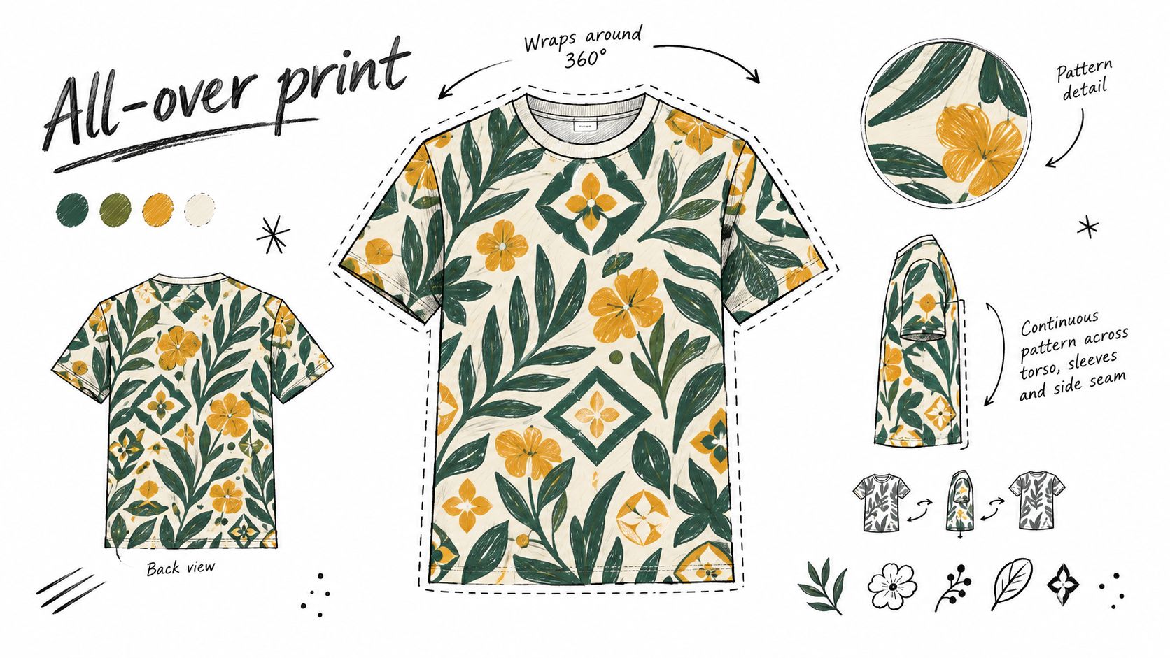
All-over print is the fastest way to make a shirt feel like a collectible object instead of standard merch. It works well for music drops, gaming events, creator launches, and limited releases where visibility matters more than conservative wearability. The wraparound format gives the design room to build atmosphere instead of squeezing everything into a front rectangle.
That extra space creates a different kind of storytelling. You can use texture, repeated motifs, layered symbols, or scenic composition that would look cramped on a standard chest print.
Before committing to this route, it helps to watch how full-garment artwork behaves in motion and across seams:
What buyers often miss
All-over designs have more failure points. Side seams interrupt patterns. Sleeves distort images. Saturated art can overwhelm the wearer. A beautiful flat file can still look awkward on body sizes with very different proportions.
That doesn't make the format risky by default. It just means you should reserve it for moments where boldness is part of the point. Concert merch, creator capsules, and fan-first event drops are strong matches. Everyday employee onboarding usually isn't.
A few constraints keep it usable:
- Design with seams in mind: Important faces, text, or logos shouldn't land where garment construction breaks them.
- Let one visual idea dominate: AOP fails when every inch asks for attention.
- Choose silhouettes carefully: Relaxed fits usually carry large surface graphics better than trim cuts.
- Set expectation early: Show 360-degree mockups or videos so buyers understand that print placement will vary slightly across sizes.
Best adaptation
If you want the drama of all-over print without the commitment, borrow one element from the format. Extend a side pattern, wrap a back graphic into the sleeve, or build a tonal repeat around a simpler front mark.
5. Vintage Distressed Design
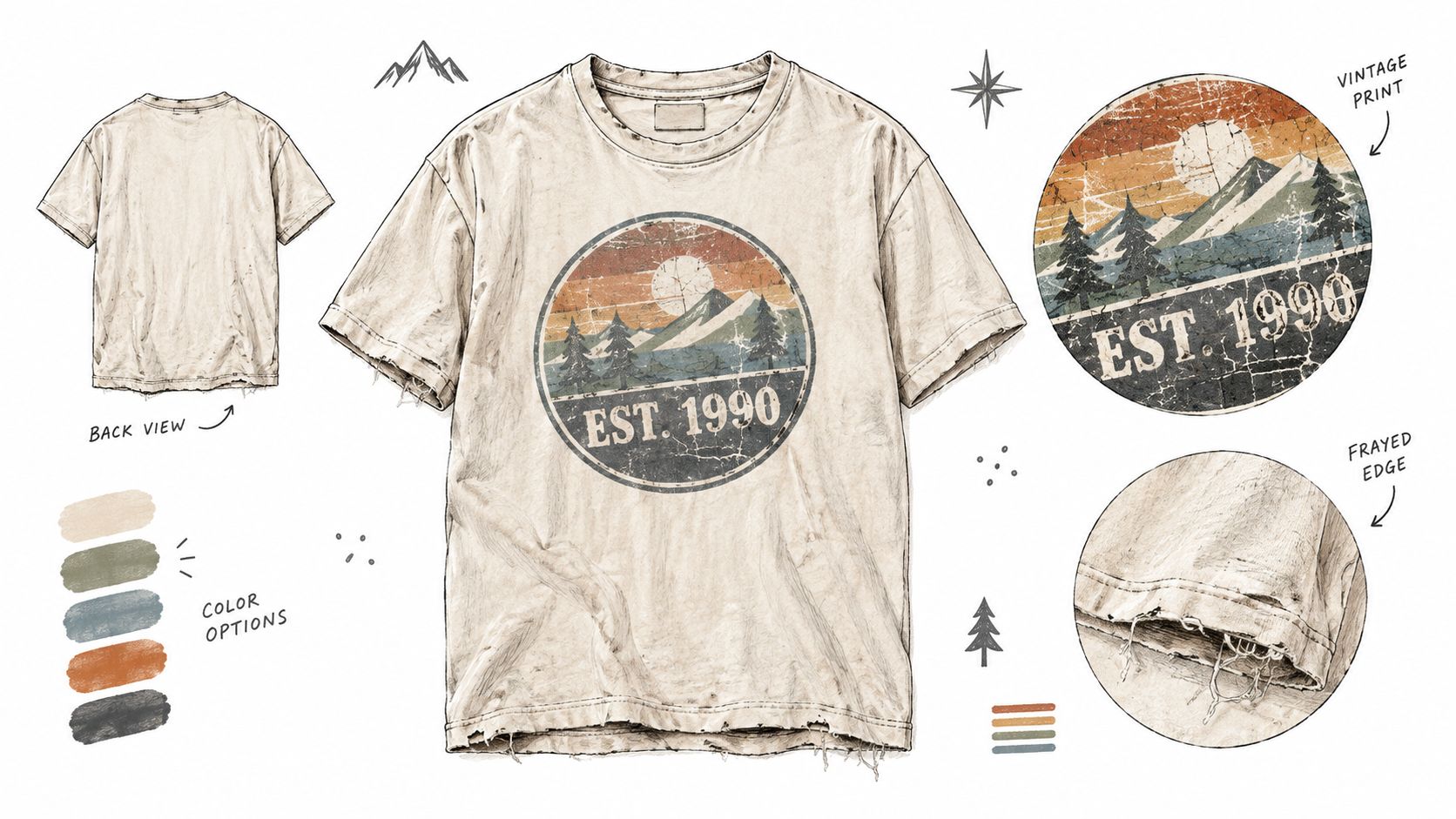
Vintage treatment works when a brand has history to reference, or when it wants to borrow the emotional cues of history without looking fake. A heritage outdoor logo, a founding-year lockup, or an anniversary shirt can all gain warmth from fade, crackle, and muted color. The appeal isn't just nostalgia. It's permission for the shirt to feel less corporate and more lived-in.
This approach is especially useful for recognition moments. A ten-year employee celebration shirt shouldn't feel like a campaign asset. It should feel personal, even if it's produced at scale.
Distress with restraint
The common mistake is over-distressing. Teams add so much wear effect that the design stops looking intentional and starts looking low-resolution. Distress should support the story, not become the story.
This is one place where garment choice matters as much as artwork. Softer washed blanks and heavier cotton often carry aged graphics more convincingly than slick, bright basics.
A vintage treatment can soften a strict brand system, but it can't fix a weak concept.
Good use cases include milestone anniversaries, founder-story merch, alumni programs, and limited internal drops tied to company history. Weak use cases include brands with no real legacy cues trying to paste faux heritage onto a completely modern identity.
Best adaptation
Start with one historical anchor. A year, original mark, archived slogan, or older color system is enough. Then add only as much aging as needed to make the piece feel cohesive. If every element is distressed, none of it feels authentic.
6. Collaborative Multi Brand Design
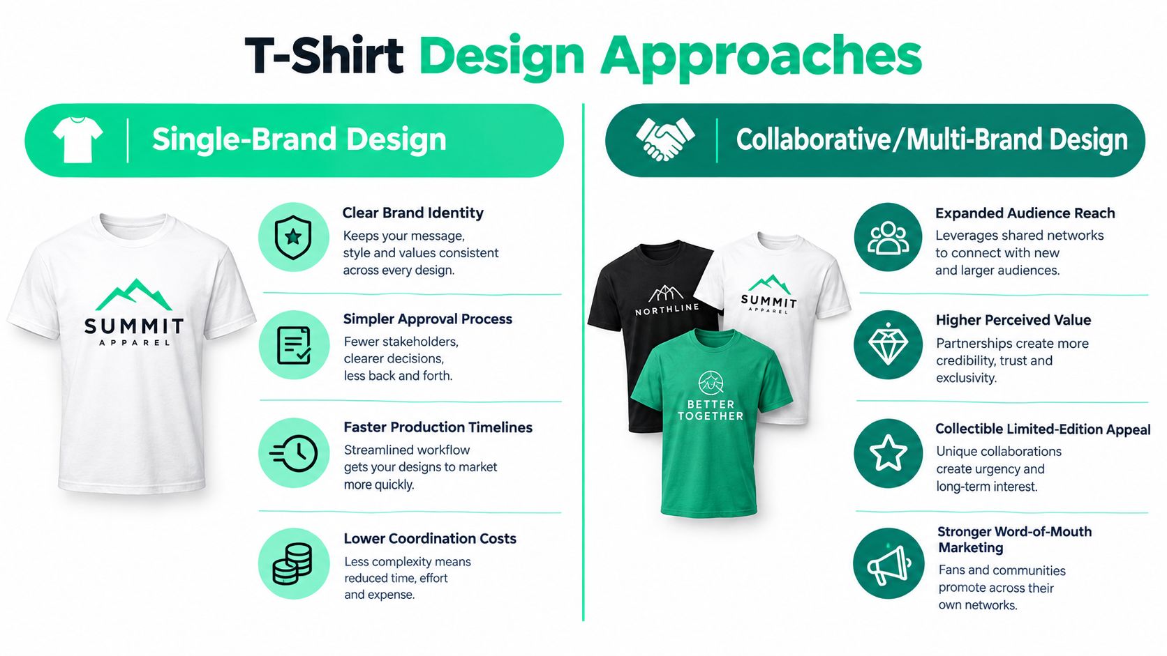
Collaboration shirts are less about aesthetics than diplomacy. You're combining audiences, identities, and approval chains into one wearable object. Supreme x Louis Vuitton became memorable partly because both names stayed legible inside the same system. That's the benchmark. Each partner should remain recognizable without turning the shirt into a sponsor wall.
This model works for co-hosted events, partner summits, creator crossovers, nonprofit fundraisers, and community campaigns where each side brings distribution. The design has to signal shared ownership without erasing hierarchy.
The real challenge is alignment
Most collaborative merch fails long before production. One brand wants subtlety. Another wants equal billing. A third stakeholder adds legal copy or campaign text. By the time approvals finish, the shirt carries too many priorities.
The better system is to define roles early:
- Primary identity: Who is leading the release?
- Secondary identity: Which brand supports but doesn't dominate?
- Shared symbol: What visual device unifies the two sides beyond logo placement?
- Audience context: Is this for attendees, fans, employees, or partners?
When the answer to those questions is vague, the artwork usually becomes a compromise. When the roles are clear, collaboration feels intentional.
Best adaptation
Use one side of the garment for the partnership and the other for the story. For example, put a unified mark on the front and reserve the back for campaign art, location, or event naming. That reduces logo congestion while still honoring both parties.
7. Data Driven Personalized Design
Personalization is one of the few t shirt design examples that changes the value of the merch without requiring louder visuals. A shirt with a new hire's name, an event attendee's role, a team designation, or a cohort year often feels more meaningful than a more elaborate generic design.
This works because the shirt acknowledges the wearer directly. For onboarding, it creates immediate belonging. For recognition, it marks a moment. For team programs, it reduces the distance between “company swag” and “my shirt.”
Here's a useful comparison visual for thinking about shared branding versus variable identity:
Personalization needs guardrails
Variable data sounds easy until someone personalizes the wrong field, breaks the brand hierarchy, or creates unreadable combinations. The safest systems personalize one controlled area only. Names under a chest logo, department labels on the sleeve, or cohort identifiers on the back work because the framework stays fixed.
For teams trying to scale that model, personalization at scale for merch programs is mostly an operational problem. Data collection, approval logic, production rules, and fulfillment accuracy matter as much as the design itself.
There's also a strategic gap here. Most trend content focuses on style, but stronger decision-making comes from matching the design to the job. Recent coverage has emphasized personalized shirts, premium blanks, and role-based shirts, while stopping short of practical selection guidance in this overview of current t-shirt design ideas. That's why subtle micro-prints work better for employee wearability, while bolder naming systems work better for event visibility.
Best adaptation
Personalize the part that reinforces the moment. Use names for onboarding, role labels for events, and achievement markers for recognition. Don't personalize just because the software allows it.
8. Sustainability Cause Driven Design
Cause-driven shirts only work when the underlying commitment is real. If a company prints “save the planet” on a low-quality tee with no operational follow-through, employees notice. Customers do too. Values-based merch is one of the easiest categories to get wrong because the message invites scrutiny.
That doesn't mean brands should avoid it. It means the design has to be backed by choices people can verify. Patagonia-style environmental language works because the shirt is part of a broader values system. A nonprofit fundraiser works when the cause relationship is explicit and credible.
Design should point to substance
Cause-led tees perform best when the message is clear, wearable, and tied to a real action. Awareness graphics, volunteer shirts, internal impact campaigns, and mission-driven collaborations can all succeed if the design isn't trying to carry the full proof burden by itself.
Operationally, sustainability also includes production decisions. A T.S. Designs screen-printing case study reported that switching to holding tanks for cleaning-chemical and water reuse cut water use by approximately 650 gallons per week, reduced reclaiming-solution consumption by 75%, and delivered $13,833 in annual savings with a 23-month payback period in this screen-printing sustainability case study. That kind of process change matters more than eco language printed on the chest.
If sustainability is part of the brief, teams should also think through the manufacturing side, not just the slogan. sustainable clothing production for merch teams becomes part of the design decision.
Cause-driven merch should make a claim the organization can defend, not just a claim the art director likes.
Best adaptation
Lead with one substantiated message and keep the design wearable. A shirt people rewear does more for a cause than an over-explained statement piece that stays in a drawer.
8 T-Shirt Design Styles Comparison
| Design Type | 🔄 Implementation Complexity | ⚡ Resource Requirements | ⭐📊 Expected Outcomes | Ideal Use Cases & 💡 Key Advantage/Tips |
|---|---|---|---|---|
| Minimalist Logo Design | Low, single/dual-color, simple placement | Low, basic screen print/embroidery, minimal setup | ⭐ High brand recognition; 📊 Consistent, scalable visuals | Ideal for onboarding/kits, corporate events. 💡 Timeless & cost-effective, keep logo 2–3" and test on colors. |
| Graphic Front/Back Placement Design | Medium, larger art, precise positioning, possible two-sided print | Medium, 2–3 color prints, larger artwork files | ⭐ High visual impact; 📊 Versatile for photos/video and scale | Ideal for events, large‑scale merch. 💡 Balanced impact, front 8–10", back 10–12"; test on sizes. |
| Niche Community/Subculture Design | Medium, needs deep cultural/contextual research | Low–Medium, varied runs, creator collaboration | ⭐ Very high engagement within target; 📊 Strong loyalty & conversion | Ideal for creator drops and community monetization. 💡 Deep resonance & premium pricing, involve community and test refs (70/30 timeless/timely). |
| All‑Over Print Design | High, full‑coverage artwork, complex print files | High, dye‑sublimation/advanced digital printing, premium blanks | ⭐ Very high memorability; 📊 Stands out on social and justifies premium price | Ideal for creator drops, festivals, limited editions. 💡 Max visual storytelling, 300+ DPI, sample test, relaxed fits. |
| Vintage/Distressed Design | Medium, faux or physical distressing, tight QC | Medium, specialty printing/blank selection, potential extra processes | ⭐ High perceived authenticity; 📊 Emotional/nostalgia-driven engagement | Ideal for anniversaries, heritage merch, recognition. 💡 Nostalgic appeal, balance distressing (70–80% opacity), use heavier cotton. |
| Collaborative/Multi‑Brand Design | High, multi‑stakeholder approvals, legal coordination | Medium–High, coordination, higher MOQ/limited runs | ⭐ High reach & perceived value; 📊 Amplified audience and collectible appeal | Ideal for cross‑brand drops, festivals, conferences. 💡 Leverages network effects, set clear logo hierarchy and approval workflow. |
| Data‑Driven/Personalized Design | High, variable data workflows, system integrations | High, variable printing tech, data management, privacy controls | ⭐ Very high personal relevance; 📊 Increased wear‑rate & engagement | Ideal for onboarding, recognition, team merch. 💡 Personal connection, start with simple personalization (names) and ensure data security. |
| Sustainability / Cause‑Driven Design | Medium, requires verification, transparent sourcing | Medium–High, sustainable blanks, certifications, documented supply chain | ⭐ High values alignment; 📊 Positive PR, talent attraction/retention | Ideal for CSR programs, fundraising, employer branding. 💡 Authentic impact, use verified certifications and communicate metrics clearly. |
Turn Inspiration Into a Repeatable Merch System
The eight approaches above are most useful when you stop treating them as isolated visuals and start treating them as design systems matched to specific moments. Minimalist logo shirts and front/back graphics are the strongest options for enterprise consistency because they travel well across teams, regions, and recurring programs. They're easy to standardize, easy to approve, and less likely to become obsolete after one event cycle.
Personalized shirts belong in onboarding, recognition, and employee-choice environments where relevance matters more than spectacle. They help the wearer feel seen, but only when the variable element is controlled. Niche community designs and all-over prints fit creator programs, fandoms, and event drops better because they reward intensity and identity. They aren't built for everyone, and that's exactly why they work.
Vintage treatment is best saved for heritage moments, anniversaries, and milestone storytelling. Collaboration designs make sense when shared audiences are part of the commercial logic, not just a nice extra. Cause-driven designs deserve the highest bar. If the operational choices and partnerships can't support the message, the shirt should stay quieter.
A practical selection pass should answer seven questions before anyone finalizes art:
- Audience fit: Who is wearing this, and what would they willingly wear again?
- Use-case clarity: Is this for onboarding, recognition, event staffing, fan sales, or partner distribution?
- Brand hierarchy: What must be seen first, and what can stay secondary?
- Garment and placement: Does the blank support the tone, and does the art suit the print zone?
- Production complexity: Are you choosing a simple chest print, front/back system, embroidery, or all-over execution for a reason?
- Approval requirements: Which stakeholders can delay or dilute the design if they enter too late?
- Sample testing: Has anyone checked how the design reads on the shirt, not just on a flat file?
That's the difference between collecting t shirt design examples and building a merch program that keeps working. The strongest teams build repeatable templates, then vary the message, audience layer, and decoration method with discipline. If you want one system that can turn prompts, URLs, videos, images, or briefs into on-brand designs and carry the program through production and fulfillment, FLYP is one option to consider. It fits teams and creators who need design generation, garment accuracy, and operational follow-through in one place.
If you're building your own process, keep the standard simple. Pick a moment, match the shirt to the wearer, and remove anything that doesn't help the piece get worn again. That's how inspiration becomes infrastructure, and it's also why teams increasingly use tools that generate listicles with AI and then operationalize the ideas into repeatable programs.
FLYP LTD gives teams and creators a way to turn prompts, briefs, URLs, images, or videos into on-brand t-shirt designs, then manage production, fulfillment, and merch operations without stitching together separate vendors. If you want these t shirt design examples to become a working onboarding, event, recognition, or creator merch system, visit FLYP LTD.