Image branding is a coordinated system of visual cues, such as logos, color, typography, imagery, and layout, that helps audiences recognize and remember an organization across every channel, including the merchandise and apparel people wear. In a 2026 study of 95 consumers in Mumbai, 53.7% agreed that consistent brand colors made a brand easier to recognize quickly across platforms, while another 53.7% agreed that consistent font usage made brand messages easier to read and remember, as reported in the study on visual consistency and brand recognition.
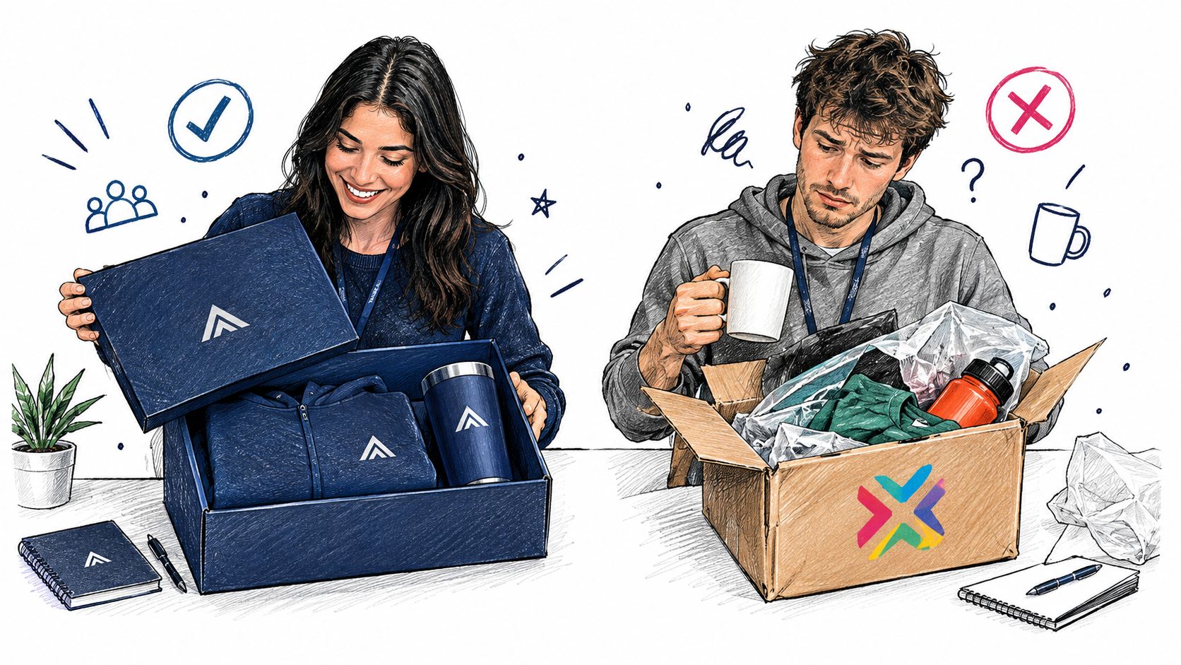
You may be the People Ops lead who has just inherited a global swag program. Two new hires receive their onboarding kits on the same morning. One opens a neatly coordinated box with a well-made shirt, a matching notebook, a clear welcome card, and colors that feel familiar from the company website. The other receives a collection of unrelated items, each using a different logo treatment, shade, and typeface.
Neither package needs a long explanation. Each one already tells a story about how the organization works.
That story is the practical answer to what is image branding. It isn't a polished logo or attractive photography. It's the deliberate, repeatable visual shorthand a brand uses to express qualities such as trust, quality, innovation, or belonging. A presentation, event banner, onboarding kit, social thumbnail, hoodie, and employee avatar should feel as though they come from the same organization.
Table of Contents
- The Moment a Visual System Either Lands or Leaks
- The Building Blocks That Make Up an Image Branding System
- Brand Identity Versus Brand Image and Why the Gap Matters
- How Image Branding Shows Up on Merchandise and Apparel
- The Measurable Benefits of Strong Image Branding
- Best Practices for Consistent On-Brand Design Across Channels
- The Co-Created Brand Employees and Creators Want to Wear
- Putting Image Branding to Work This Quarter
The Moment a Visual System Either Lands or Leaks
The well-designed onboarding kit creates a sense of intention before the new hire reads the welcome note. The shirt fits the visual language of the company. The box uses the same color relationships as the careers page. The logo is visible, but it doesn't have to dominate every surface because the surrounding choices already reinforce recognition.
The mismatched kit produces a different effect. Perhaps the logo is technically correct, but the colors are outdated, the garment feels generic, and the printed message uses a typeface no one sees anywhere else. The new hire may not describe the problem in design language. They may feel that the company hasn't connected its promises to its details.
A logo file can't carry the whole experience
A logo identifies an organization, but image branding organizes the cues around it. Those cues include:
- Color: The palette creates a recognizable visual environment across screens, paper, fabric, and packaging.
- Typography: Type choices affect how approachable, technical, premium, or practical a message feels.
- Imagery: Photography, illustration, and composition establish a consistent emotional tone.
- Application: Placement, scale, spacing, and production choices determine whether the system survives in real use.
The need for this system has grown as enterprise teams, creators, regional offices, and AI-assisted tools produce branded assets at greater volume. More output creates more opportunities for recognition, but it also creates more opportunities for drift. A shared brand asset management workflow can help teams control approved files, versions, and usage rules before inconsistent artwork reaches production.
The Mumbai study offers a useful practical signal. 53.7% of respondents agreed that consistent colors support faster recognition, and 53.7% agreed that consistent font usage improves readability and memorability. The same study reported a statistically significant relationship between consistent visual exposure and the speed and accuracy of recognition. For a People team, that means every kit, event shirt, and internal banner contributes to the same mental picture.
Practical rule: Treat every wearable item as a public brand touchpoint, not as leftover promotional inventory.
The Building Blocks That Make Up an Image Branding System
Think of an image branding system as a team uniform. The uniform doesn't require every player to wear an identical garment in every situation, but it does need stable cues that make the team recognizable. A training top, formal jacket, and event shirt can differ while still belonging to the same visual family.
Start with the recognizable core
The logo or mark is the identifying badge. Define the master artwork, clear space, minimum reproduction size, and monochrome versions so it remains legible on a small avatar, a presentation, a cap, or a large event backdrop.
Color works like the team's home and away kit. Specify approved color values and acceptable combinations rather than relying on a designer's approximation. Fabric, thread, paper, and screens can render the same color differently, so production files need practical guidance.
Typography supplies the voice of the system. Set primary and secondary typefaces, hierarchy, weights, and fallback options. A font that looks excellent on a website may be unavailable in an event tool or difficult to embroider.
Photography and illustration establish the brand's visual mood. Decide whether imagery should feel documentary, candid, editorial, technical, playful, or highly composed. The choice affects how employees and customers interpret the organization before they process the words.
Layout, iconography, and motion give the system rhythm. Recurring margins, shapes, icon styles, transitions, and content blocks make different channels feel related. Packaging and apparel then translate those choices into physical objects.
| Element | Role in the System | Typical Specification |
|---|---|---|
| Logo and mark | Identifies the organization | Master files, clear space, minimum size, monochrome versions |
| Color palette | Builds recognition and mood | Approved values, combinations, light and dark treatments |
| Typography | Creates hierarchy and personality | Typeface families, weights, sizes, fallback rules |
| Imagery | Shapes emotional interpretation | Photography direction, illustration style, cropping guidance |
| Layout and composition | Creates visual rhythm | Grid, spacing, alignment, safe zones |
| Apparel and packaging | Carries the system into physical life | Placement, decoration method, garment and substrate guidance |
Design for production, not just presentation
A system that works only in a brand deck isn't a working system. A chest mark may need different artwork from a back print. A detailed illustration may need simplification for embroidery. A color combination that looks balanced on a monitor may lose contrast on heathered fabric.
A quantitative analysis of 135 corporate logos reported a broad movement toward simplified two-dimensional forms, reduced color usage, and greater reliance on logotypes, particularly among global brands, as described in this analysis of corporate logo design. Simplification can improve legibility and production reliability, but it shouldn't erase the distinctive cues that separate your organization from competitors.
For physical programs, it can help to browse custom branded items for events while testing how your system behaves across garments, packaging, and event formats. The final question isn't whether each item looks attractive in isolation. It's whether the collection still feels like one brand when people see it together.
Brand Identity Versus Brand Image and Why the Gap Matters
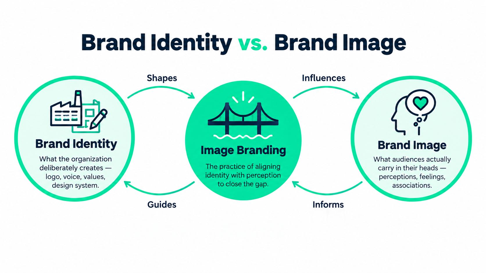
Brand identity is what the organization deliberately creates. It includes the name, logo, visual system, voice, values, behavior, and experience the company intends to offer. Brand image is what audiences carry in their heads after encountering those signals and living through the experience.
Image branding connects the two. It gives identity a consistent visible form, but it can't force audiences to interpret that form exactly as intended.
A café makes the distinction easy to see. The owners choose the menu design, staff aprons, storefront sign, takeaway cup, interior colors, and tone of service. Those choices express identity. One customer may experience the café as welcoming and thoughtful, another as expensive but impersonal, and an employee may see a gap between the friendly signage and the pressure of the workplace.
The same principle applies to an enterprise onboarding kit. The People team may select a carefully designed box to communicate belonging, but employees also notice whether the item is useful, comfortable, inclusive, and aligned with the culture they experience every day.
Consistency isn't the same as credibility
A visually consistent system can reinforce the wrong perception if the lived experience contradicts it. A company can't print collaboration on a hoodie and expect the garment to resolve poor communication. It can, however, make its intended values easier to recognize when the employee experience supports them.
That makes perception an operational concern, not only a creative one. Teams should compare intended identity with actual responses through employee pulse surveys, customer feedback, asset adoption, and conversations around real touchpoints. A practical brand guidelines framework should therefore explain not only how assets must look, but what the organization wants people to feel and understand.
For People Ops, the implication is direct. Onboarding kits, event apparel, internal communications, and recognition gifts shape brand image whether anyone measures them or not. The job isn't to enforce a perfect surface. It's to make the visible system support a credible experience.
How Image Branding Shows Up on Merchandise and Apparel
A People Ops lead can spot image branding in a simple onboarding moment. A new hire opens the kit, tries on the shirt, and decides whether it feels like something to wear beyond the first day. That reaction turns an abstract brand promise into a visible signal employees may keep, share, or leave in the drawer.
Merchandise gives brand strategy a physical form. A hoodie can appear at a conference, during a video call, on a commute, or in a creator's post long after the original event. People display it when the garment feels comfortable, the design feels considered, and the message fits how they want to present themselves.
Every production choice communicates
Start with the garment, not the logo. A carefully built identity can look careless on poor fabric or in an awkward position. Review the relationship between:
- Fabric and color: Ink and thread can look different on cotton, fleece, synthetic, and textured materials.
- Decoration method: Screen printing, direct-to-film, embroidery, and other methods set different limits for detail, gradients, texture, and color.
- Placement and scale: A chest mark, sleeve graphic, large back design, and cap decoration each need suitable artwork and proportions.
- Program context: An onboarding kit, employee-choice store, event drop, and creator collaboration can share core cues while serving different audiences.
Teams learning how to print images on shirts with DTF can see why artwork preparation must happen before approval. Record which assets suit each production method so suppliers are not left to interpret files independently.
Build a controlled collection, not isolated items
A global merch program needs a stable core and useful variation. The core can include approved marks, color relationships, typography, and tone. Variation can reflect garment type, regional needs, team campaigns, creator artwork, or event themes.
FLYP is an AI-native merch operating system that turns prompts, URLs, videos, images, and briefs into on-brand, garment-accurate designs across 600+ premium blanks in minutes, then manages manufacturing, fulfillment, shipping, customer service, and returns end to end. Whether a team uses FLYP or another workflow, approve the system before scaling the output.
A useful custom merch creation workflow includes garment previews, decoration checks, size and placement review, accessibility review where text appears, and a named approver. Those steps turn merchandise from an improvised swag line into a repeatable expression of the brand. A shirt should look ready for real life, not merely correct in a presentation file.
The Measurable Benefits of Strong Image Branding
Strong image branding matters because visual signals influence the associations people form before or alongside direct product experience. The value isn't consistency for its own sake. It's the accumulation of recognizable cues that help people identify, trust, and remember an organization.
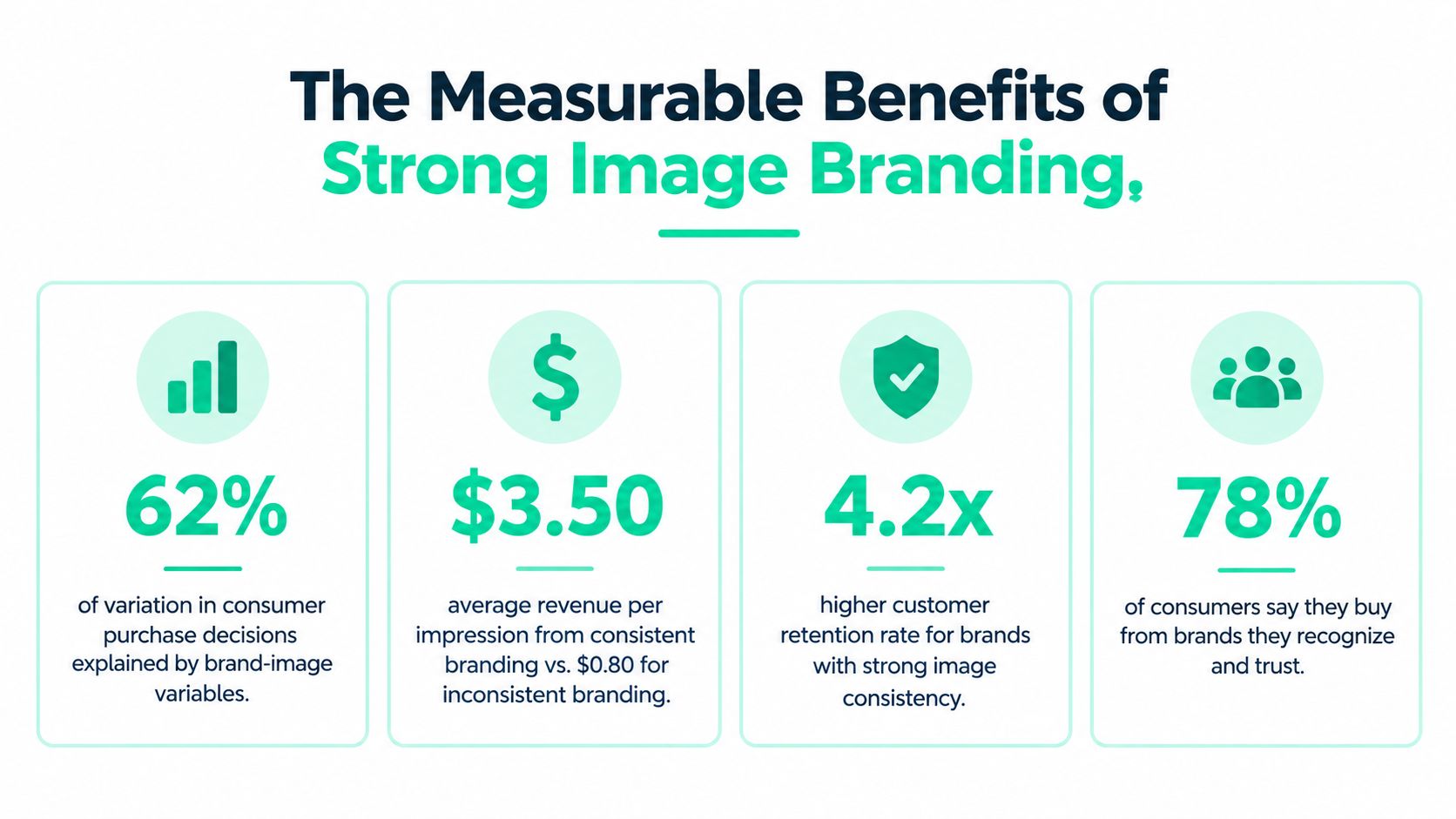
A 2026 empirical study reported that brand-image variables explained 62% of the variation in purchase intention. The study identified trust as the strongest influence, with β = 0.37, followed by perceived quality at β = 0.31 and emotional attachment at β = 0.28, as reported in this empirical study of brand image and purchase intention.
Translate the finding into daily decisions
For a People Ops lead, trust may appear as confidence that a new hire kit reflects the company accurately. Perceived quality may show up in the feel, fit, and finish of a conference shirt. Emotional attachment may develop when employees choose to keep wearing an item because it represents a team, milestone, or shared experience.
The same visual system can support recognition in lower-attention environments. A person may see a social thumbnail for a second, notice a familiar event shirt in a crowd, or encounter a small brand mark on a tumbler. Repeated cues make it easier to connect these moments to one organization.
Measure the system, not just the shipment
A merch program can track operational delivery, but brand evaluation needs broader questions:
- Recognition: Can employees and customers identify the organization without a prominent wordmark?
- Perceived quality: Do people describe the visual system and physical items as considered and reliable?
- Trust: Does the branded experience support the promises made in recruitment, marketing, and customer communication?
- Participation: Do recipients voluntarily wear, share, reuse, or request the items?
The research concerns a particular empirical setting, so it shouldn't be treated as a universal forecast for every market. It does provide a strategic reason to connect image branding with business outcomes rather than evaluating a shirt only by whether the logo is present.
Best Practices for Consistent On-Brand Design Across Channels
A brand system becomes useful when people can apply it under ordinary pressure. The careers page, Slack banner, presentation deck, onboarding kit, event wall, and back print should not require a fresh debate about basic visual decisions every time.
Make accessibility part of the brand system
Branded images often contain headlines, calls to action, product information, or event details. If the text disappears into the background, the design has failed its communication job even if the colors match the official palette.
WCAG 2.2 sets a minimum contrast ratio of 4.5:1 for normal-size text and 3:1 for large text. Its enhanced AAA criterion raises those thresholds to 7:1 and 4.5:1, respectively, according to the W3C guidance on enhanced contrast. Test recurring text and background combinations, prepare light and dark treatments, and reserve readable safe zones for overlays.
Logo text has a specific exemption from the contrast rule, but surrounding campaign copy doesn't receive the same protection. Provide alt text for meaningful brand photography, icons, and logos, especially in employee-facing and customer-facing digital content.
Protect recognition at every size
Create master assets and define minimum sizes, clear space, background restrictions, monochrome variants, and approved placements. A mark that works on a large banner may lose its details on an avatar or embroidered cap.
For physical displays, guidance on colour and scale for displays can help teams think through viewing distance, proportion, and legibility. Then apply the same discipline to garments and digital layouts.
Give governance a human owner
An asset library needs more than folders. Assign owners for approvals, archive outdated versions, record production-ready files, and make regional variations explicit. A practical review checklist can ask:
- Does the asset use an approved logo, color, and type treatment?
- Does the design remain legible at its intended size and decoration method?
- Does the imagery reflect the intended audience and context?
- Does the item support the experience the brand promises?
- Can another team reproduce the decision without guessing?
The Co-Created Brand Employees and Creators Want to Wear
A global onboarding shirt can reveal whether an image branding system works in practice. The company may approve the artwork, but employees decide whether the shirt feels good enough to wear, share, or leave in the drawer. Their choices, along with those of creators, customers, and regional teams, help shape the brand in public.
Image branding reflects both what an organization presents and what people experience inside it. A precisely controlled logo can sit on apparel nobody wants to wear. A flexible design may travel further when employees and creators can adapt it to their context while preserving recognizable cues.
Separate the fixed core from the permission to adapt
Generative AI can produce large volumes of visually consistent assets. It can also multiply designs that feel culturally tone-deaf, inaccessible, generic, or disconnected from the audience's lived experience. A People Ops lead managing global merchandise needs a system that sets clear boundaries without making every regional shirt identical.
A durable system protects a stable core:
- Recognition cues: Keep essential colors, symbols, typography, and marks identifiable.
- Safety rules: Review cultural context, accessibility, legal usage, and production feasibility.
- Local expression: Let regional teams, creators, and employee groups adapt themes and applications.
- Feedback loops: Ask whether people recognize the brand, trust the expression, and want to participate.
A useful review goes beyond guideline compliance. Ask whether participants voluntarily make the asset part of their lives, not only whether it follows the guideline. An employee-choice store, regional event design, or creator drop can strengthen image branding by giving people a credible way to express belonging.
A brand becomes more durable when people choose to carry it. A shirt worn by choice communicates more than one reproduced only because instructions required it.
Putting Image Branding to Work This Quarter
Start with three ideas. Image branding is a system, not a logo. Its job is to connect the identity an organization creates with the image people hold. Merchandise and apparel are among the clearest tests because people decide whether to wear them in public.
Use the next planning cycle to:
- Audit assets: Find outdated logos, inconsistent colors, unapproved type treatments, and duplicate files.
- Test contrast: Check recurring text and background combinations across digital assets and printed materials.
- Review merchandise fit: Evaluate fabric, decoration, placement, comfort, usefulness, and whether people voluntarily use each item.
- Check perception: Ask employees, customers, or creators what the visual system communicates and where it feels disconnected.
- Assign ownership: Name the people responsible for approvals, regional variation, production QA, and updates.
Every useful touchpoint makes the next decision easier. Every shortcut, from a low-contrast event graphic to a mismatched onboarding shirt, spends a little of the recognition the organization has earned.
FLYP LTD offers an AI-native merch operating system that turns brand inputs into garment-accurate designs and supports manufacturing, fulfillment, shipping, customer service, and returns. If you're building a global onboarding, recognition, event, or creator merch program, visit FLYP LTD to explore a more controlled way to turn image branding into apparel people want to wear.