You've approved the graphic, shared it in Slack, and collected a round of thumbs up. Then the sample arrives. The print sits near the stomach on the fitted cut, crowds the side seams on the small, and nearly disappears against the charcoal blank your events team insisted on. Nothing was wrong with the artwork itself. Nobody had designed it for the actual shirts people would wear.
Table of Contents
- Why Custom T Shirt Design Starts With the Garment
- Build a Production-Ready Creative Brief
- Turn Brand Inputs Into Precise Design Prompts
- Choose Garments and Decoration Methods
- Create Garment-Accurate Mockups and Specifications
- Preflight and Approve Before Production
- Create a Reusable Custom T Shirt Design System
Why Custom T Shirt Design Starts With the Garment
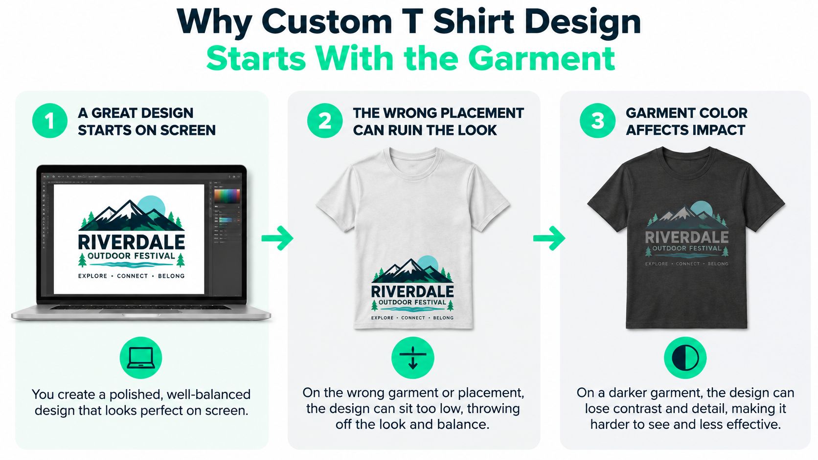
That failure shows up constantly in enterprise merch. A conference team designs a wide, detailed front print for a classic crew, then adds an oversized boxy cut and a fitted women's style at ordering. The same file gets scaled to fit the smallest printable area, so it looks lost on larger sizes, or it stays large and wraps awkwardly on smaller bodies. On the dark colorway, the mid-tone brand color loses contrast and the headline becomes unreadable from across a room.
The fix is to treat custom T shirt design as garment development, not graphic generation. You pick the substrate, silhouette, fabric composition, and fit range first, then you design inside those constraints. Constraints sound limiting, but they're what let a designer set type size, line weight, and color contrast that survive real fabric and real bodies.
The infographic below shows how quickly a polished screen concept breaks down once placement and blank color change.
What garment-first actually changes
Start with the wearer experience. An onboarding shirt needs to feel like a welcome gift a new hire keeps, so softness and a cut they'll wear outside work matter more than unit price. A field events shirt needs breathability and a print that stays legible in photos. Those are different garments before they're different graphics.
Early garment decisions also lock the printable area, safe distance from seams and collar, and color palette you can use. If you're comparing blanks, a guide to premium blank t-shirts worth building a program around helps you judge weight, construction, and fit before artwork starts, not after a sample disappoints you.
The commercial stakes justify the discipline. The global custom T-shirt printing market was valued at approximately USD 5.2 billion in 2024 and is projected to reach USD 9.8 billion by 2030, an estimated 11.5% CAGR from 2025 through 2030, according to the custom T-shirt printing market estimate for 2024 to 2030. That's a structured apparel category, not an occasional swag purchase.
Artwork, mockup, sizing, decoration method, and quality acceptance have to agree before approval. If one of them is still a guess, you don't have an approved design yet.
Build a Production-Ready Creative Brief
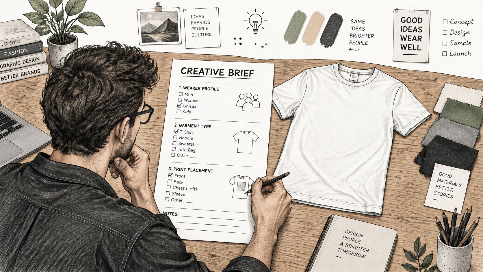
A brief that only says "make something on-brand for the summit" produces attractive concepts you can't manufacture. Designers guess at the garment, stakeholders guess at the message, and production discovers the gaps last. A production-ready brief answers the operational questions before anyone opens a design file.
The workspace below captures the right starting point, a written brief beside early sketches rather than finished art looking for a purpose.
What the brief must contain
- Wearer and use case: Who receives it, where they'll wear it, and whether it should read as uniform, gift, or retail merchandise.
- Quantity and regions: How many, which countries, and whether sizing, shipping, or language variants change the design.
- Garment silhouettes: The specific cuts, colors, and size ranges in scope, plus any styles explicitly out of scope.
- Brand assets: Logo files, brand colors, typography, approved imagery, and the exact messaging hierarchy.
- Approvals and deadline: Named approvers, proof requirements, delivery date, and what success looks like beyond "people liked it."
Each field prevents a specific rework loop. Naming regions early stops a designer building around a slogan that doesn't translate. Naming approvers stops a late executive review from reopening color choices after samples are made.
One brief format, three different answers
An onboarding kit brief prioritizes durability, inclusive sizing, and a design subtle enough for weekly wear, because the shirt represents employment, not a single day. A conference drop brief prioritizes legibility at distance, fast size distribution, and a date or city reference attendees want to keep. A creator collection brief prioritizes retail feel, distinctive graphics, and colorways fans would pay for, because nobody's obligated to buy it.
Same template, different decisions. That's the point. The brief forces each program to declare its trade-offs instead of borrowing assumptions from the last order.
The U.S. context shows why this rigor scales. The United States custom T-shirt printing market was valued at USD 857.5 million in 2023, about 18.18% of the global industry, and was forecast to grow at an 11.8% CAGR from 2024 to 2030, per the U.S. custom T-shirt printing market figures for 2023. Programs operating at that scale can't run on hallway approvals.
This walkthrough shows how brief details translate into design decisions you can review before production.
Key takeaway: A strong brief reduces avoidable design, approval, sizing, and rework problems because it settles purpose, garment, and ownership before creative exploration begins.
Turn Brand Inputs Into Precise Design Prompts
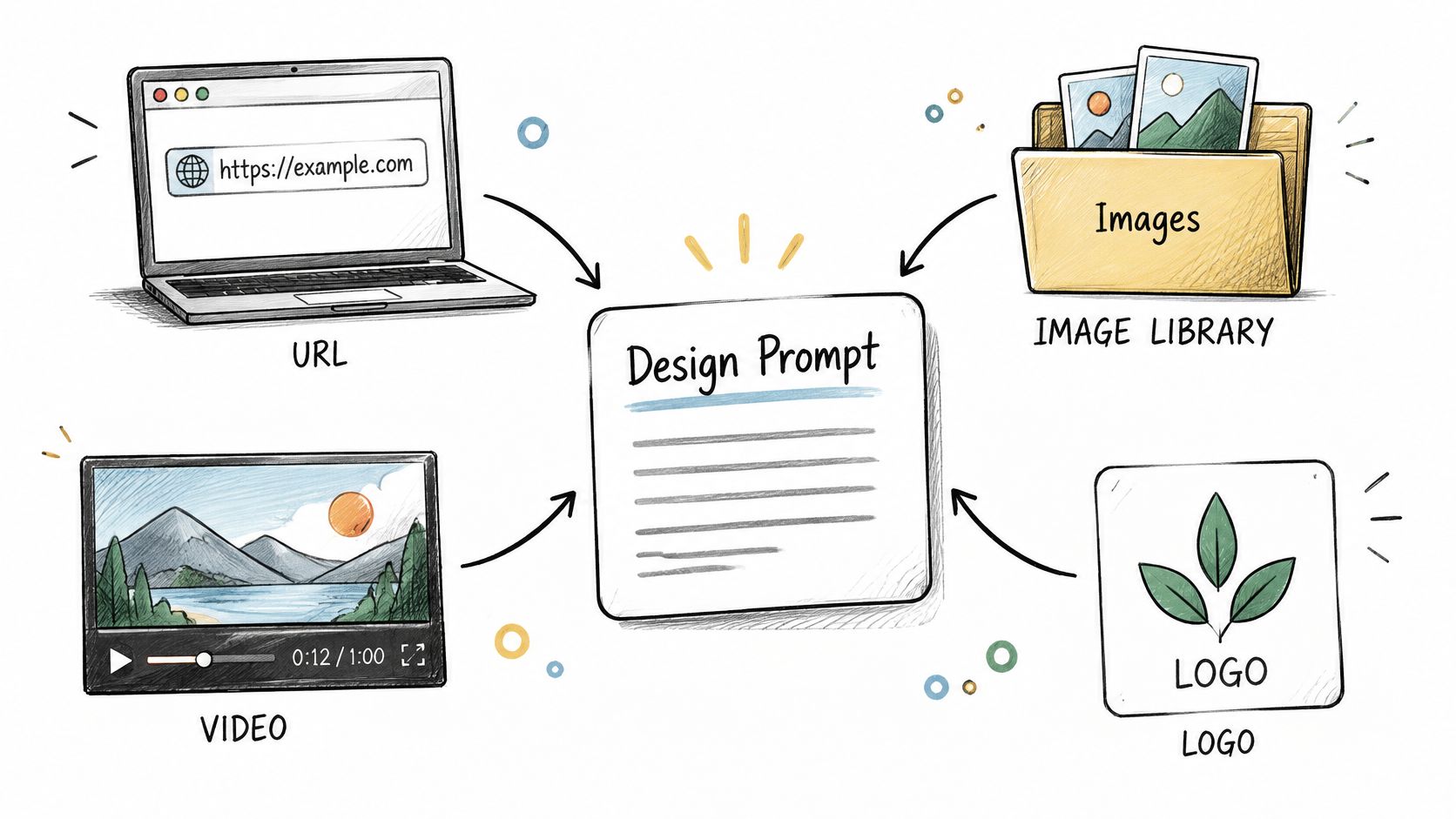
Teams don't lack inputs. They have a campaign landing page, a logo folder, event photography, product screenshots, and three contradictory opinions about tone. The work is converting that pile into a prompt or creative direction a designer, human or AI-assisted, can execute without inventing your brand for you.
The diagram below maps how scattered inputs should converge into one controlled direction.
A prompt formula that holds up
Separate requirements from exploration space. Requirements include the exact logo version, brand colors, required text, garment color, print placement, and anything legal restricts. Exploration space covers illustration style, composition, texture, and secondary motifs. When you don't separate them, reviewers reject entire concepts over one fixable element, or worse, a model redraws your logo creatively.
Write the prompt in this order. Name the wearer and setting first, then the visual hierarchy, meaning what should be read first, second, and last. Then state garment and placement constraints, the style references you're pointing to, and explicit exclusions such as no gradients, no distressed effects, or no text below a legible size.
Two prompts, two programs
For an enterprise recognition shirt, the prompt might specify a restrained chest graphic, the award name as the dominant element, the year as secondary, and a palette limited to two brand colors on a navy blank. Exclusions matter here, no trophy clip art, no internal jargon employees wouldn't wear in public.
For a creator-led drop, the prompt can open up. Reference a specific video moment or community phrase, allow a large back print, and invite illustration. The essentials still hold, correct wordmark, no third-party characters, and artwork that works on both black and washed-out vintage blanks.
Apparel categories beyond tees benefit from the same discipline. If your team also outfits staff uniforms, this walkthrough on how to customize golf uniforms step by step from Caddie Uniform shows how structured choices about fit, color, and logo placement prevent drift across a full kit.
Handling revisions without chaos
Replace vague feedback like "make it pop" with a revision protocol tied to hierarchy. Say which element should gain emphasis, what it should take space from, and what must not change. Keep a master concept document, then request garment-specific versions from it, rather than letting each variant become its own design.
Label every output. Mark files as creative reference or production candidate, because a beautiful generated mockup isn't print-ready artwork. Platforms such as FLYP can turn prompts, URLs, and images into garment-based concepts, but you still need a human decision about which output earns specification work.
Choose Garments and Decoration Methods
A navy onboarding tee can pass a brand review and still fail on the production floor. The blank changes how ink sits, how the collar holds shape, how a size run behaves across a 200-person order, and how artwork survives the first ten washes. Treat garment, sizing system, decoration method, and factory conditions as design inputs from the first sketch, especially when one campaign has to serve onboarding kits, event drops, and employee-choice stores.
How garment types behave
Lightweight cotton breathes well and generally gives screen-printed ink a more receptive surface than many synthetic alternatives, consistent with the industrial screen-printing conditions study on substrate and environment. It suits everyday staff and attendee shirts, though very light fabric can feel flimsy for a premium gift.
Cotton blends add shape retention and reduce shrinkage, which helps programs reordering across seasons. Print behavior varies by blend ratio, so proof the exact blank rather than trusting the category name. Performance fabrics serve outdoor events and sports communities, but synthetic surfaces introduce dye migration risk, where garment dye bleeds into light ink and shifts your brand color.
Silhouette carries equal weight. Oversized cuts give graphics room and a retail feel, but prints can drift low as fabric drapes. Fitted cuts hold placement predictably, yet wide graphics distort across the body. Gender-inclusive silhouettes simplify ordering for large groups, though one cut rarely fits every body equally well, so size range and model photography carry more weight. Approve size runs on the blank itself; the sewn-in label can mislead across suppliers and markets.
Match the garment to the moment. Onboarding kits need a stable hand feel and reliable reorders. Event drops need a graphic that reads at distance and survives fast turnarounds. Employee-choice stores need one artwork system that stays coherent across cuts people select themselves.
Matching artwork to process
Process choice follows the art and the blank together. Spot-color screen printing suits limited-color graphics where you need high repeatability across a long run. Digital printing suits photographic or gradient-heavy artwork that screen separations would flatten. If you're weighing a stitched finish against ink for logos, this comparison of embroidery versus print for company apparel covers where each route holds up.
Resolution language differs by process, which confuses teams approving files. A textile-printing study separates screen printing at roughly 150 lines per inch from digital output around 300 dots per inch, and names registration, color matching, dot geometry, penetration, intensity, and wash and light fastness as quality dimensions in the textile printing quality dimensions research. You need your specification to state which dimensions the supplier will measure, on which blank, and against which approved sample.
| Design or Program Need | Garment Consideration | Decoration Route to Evaluate | Proof Required |
|---|---|---|---|
| Bold logo, few colors, large event run | Cotton or blend with stable surface | Spot-color screen printing | Strike-off on each blank color |
| Photographic or gradient artwork | Smooth, light-colored blank preferred | Digital printing | Life-size proof checking color accuracy |
| Outdoor or athletic event | Performance synthetic fabric | Process rated for synthetics | Dye migration and wash test |
| Premium onboarding gift | Heavier or retail-feel silhouette | Screen print or embroidery evaluation | Wear test plus laundered sample |
| Employee-choice store with multiple cuts | Oversized, fitted, and inclusive styles | Method consistent across all blanks | Garment-specific proof per cut |
Use the matrix to narrow options, then proof the combination. A method that looks right on paper still fails if it isn't validated on your exact blank and colorway.
Create Garment-Accurate Mockups and Specifications
A flat mockup with your graphic pasted on a generic shirt photo is a presentation tool, not an approval tool. Garment-accurate mockups show the design at true scale on each silhouette, size range, and colorway you're ordering. That's where hierarchy problems become visible while they're still free to fix.
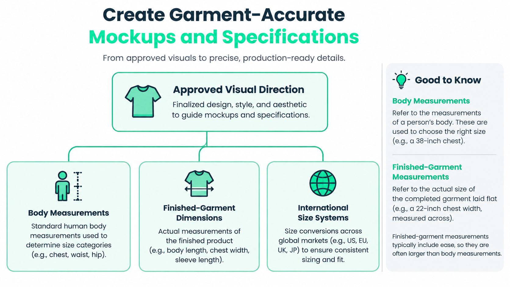
The diagram below breaks down the measurement inputs a credible mockup depends on.
Measurements teams routinely confuse
Body measurements describe the person. Finished-garment measurements describe the shirt laid flat, including ease built into the cut. Mixing them up produces size charts that mislead employees ordering remotely, especially across international size systems where a labeled large in one market doesn't match another.
The cost of getting fit wrong is documented. Available 2025 industry estimates put global online apparel returns at about 26%, with fit issues responsible for roughly 53% of apparel returns, according to the apparel return rates by category and country analysis. For employee kits, returns become exchanges, reshipping, and a new hire whose welcome shirt doesn't fit.
Build mockups that preserve the relationship between graphic proportions and garment dimensions. Show print boundaries, check the design on the smallest and largest sizes rather than only a medium, and use varied body types in review imagery. An apparel mockup generator built around real garment templates helps you test scale across blanks before committing to physical samples.
The specification sheet
Your spec package should let a supplier reproduce the design without asking what you meant. Include these elements every time.
- Artwork files: Vector files for logos, type, and flat shapes, with raster imagery only at final size and sufficient resolution.
- Color references: Named spot colors or a locked color standard, never a screenshot as the reference.
- Placement and dimensions: Graphic size plus measured distance from collar, seams, or hem for each garment.
- Garment and method: Exact blank, fabric composition, colorway, and decoration route per variant.
- Finishing expectations: Registration tolerance, curing requirements, and file naming that ties each file to its variant.
If you're formalizing this handoff, a structured tech pack template from Genpire gives you a starting format for measurements, materials, and construction notes suppliers already understand.
Watch for artwork that fails on paper first. Tiny reversed type fills in, unsupported transparencies print unpredictably, and untrapped adjacent colors can show gaps if registration shifts. Catching those in specification review is cheaper than catching them on a strike-off, and far cheaper than catching them in a warehouse.
Approve a master design plus controlled variants, not a single file stretched everywhere. Each variant records what changed, scale, placement, or colorway, and why.
Preflight and Approve Before Production
A file that looks perfect on a calibrated monitor can still fail on the garment. Preflight exists to close that gap, and it runs in two stages: a digital check of files and variants, then a physical proof on the actual blank. Programs that skip the second stage discover color and adhesion problems after bulk production, when the only options left are reprint or accept.
Digital preflight checklist
Verify scale and placement at life size rather than zoomed to fit your monitor. Confirm the smallest text stays legible, check that color references are named standards instead of RGB values, and open every exported file to confirm fonts, layers, and transparency survived. Then compare variants side by side. Drift between colorways and cuts hides when you review files one at a time.
Fabric compatibility belongs in this stage too. Confirm the decoration method is rated for each blank's fiber composition, and flag synthetics for dye migration testing before anyone prints a run.
Physical proof and environmental risk
Require a garment-specific strike-off, a printed sample on the exact blank and colorway, for every variant. Inspect color against your reference under neutral light. Check registration where colors meet, test adhesion by stretching the print, and launder the sample before approving. Cracking or peeling after one wash tells you curing or ink compatibility is wrong, and it tells you in time.
Treat the production environment as an engineering variable. The industrial screen-printing study cited in the garment selection section reported that humidity explained about 67% of defect-incident variation and temperature a further 12%, while facilities using dehumidification recorded mean defect rates of 3.1% versus 14.6% without it. You won't control your supplier's facility directly, but you can ask whether press conditions stay standardized around 23 to 26°C with relative humidity below 50%, and you can hold bulk release until a sample printed under controlled conditions passes.
Color defects deserve specific attention at proof stage. The textile printing quality-control study cited earlier reported an average defect rate of 6%, with blurred color representing 56% of observed defects. Blurred edges on a strike-off won't sharpen themselves in production.
Approval rule: A screenshot is not an approved artifact. Approval records the garment, color, placement, decoration method, and proof result together, with a named approver.
That record protects everyone. The same gate applies whether the run is a quarterly onboarding reorder or a one-time event drop, and if production deviates, you point to a specific proof rather than debating what the design was supposed to look like.
Create a Reusable Custom T Shirt Design System
The payoff for all this rigor is reuse. When your brief format, master artwork, garment variants, specifications, and proof records connect in one system, the next campaign starts from documented decisions instead of someone's memory of what worked last spring.
Build the system around a short sign-off record for every design. Capture purpose, blank, size range, artwork version, placement, color reference, decoration route, strike-off result, laundered result, and named approver. Ten fields, completed once, answer nearly every question a reorder, new region, or new team member will ask later.
Adapting the system across programs
Onboarding kits reuse the same approved variants continuously, so the system prioritizes consistency and stock accuracy. Event drops reuse the process but not the artwork, so templates for hierarchy and placement speed up each new design. Employee-choice stores reuse size guidance and garment photography, letting individuals pick cuts they'll wear, which cuts the volume of unwanted sizes you'd otherwise ship and write off.
That last point is where sustainability becomes measurable instead of rhetorical. Ordering fewer unwanted items, consolidating shipments, and choosing durable blanks people keep beats a vague eco claim on a spec sheet. Policy is moving the same direction. EU member states were required to establish separate textile-waste collection from January 2025, while EU ecodesign policy introduces expectations around durability, reparability, energy efficiency, and recycling, outlined in the European Parliament overview of textile production and waste policy.
Measure cost and waste per item kept and worn, not unit price at purchase. A premium blank that survives years of washing and gets worn weekly outperforms a cheap shirt that lands in a drawer, on both budget and impact. Your sign-off records, exchange rates, and reorder patterns give you the data to prove it.
Adapt the system to each campaign and market. Don't copy one artwork file onto every blank and call it global consistency. Consistency lives in the process, the brief, the proof gates, and the records. The artwork should flex to fit the garment, the wearer, and the moment.
Ready to stop approving screenshots and start approving garments? FLYP LTD turns your briefs, prompts, and brand assets into garment-accurate designs across premium blanks, then manages proofing, production, and global fulfillment for onboarding kits, event drops, and employee-choice stores. Visit FLYP LTD to build your next custom T shirt program on a system designed to get worn, not just shipped.