Only 30.5% of employees said their last branded item matched what they would have chosen, and 37.9% still used it regularly. The practical answer is to treat a company shirt as a selectable, wearable product, not a generic giveaway, then validate the garment, artwork, and production file before placing a full order.
That preference gap changes how teams should approach company shirt design ideas. A clever graphic can't rescue a scratchy blank, poor fit, weak contrast, or a shirt nobody would choose outside work. The strongest programs start with the wearer, select a garment for its real use, simplify the artwork for the printing method, and test the finished result before scaling.
The tradition behind branded apparel is old, but employee expectations have moved. Branded merchandise is commonly traced to campaign buttons from 1789, while a widely cited early promotional-merchandise milestone dates to 1878, when Jasper Meek printed burlap book bags for a shoe store, as documented by the Promotional Products Association International's history of branded merchandise. Today, utility and voluntary wear matter more than novelty.
Table of Contents
- Why Most Company Shirts Miss the Mark
- Choosing the Right Company Shirt Strategy
- Selecting Garments and Materials for Everyday Wear
- Designing Brand-Ready Graphics That Print Well
- Validating Designs Before Full Production
- Real Company Shirt Scenarios and How to Adapt Them
- Practical Next Steps for a Stronger Shirt Program
Why Most Company Shirts Miss the Mark
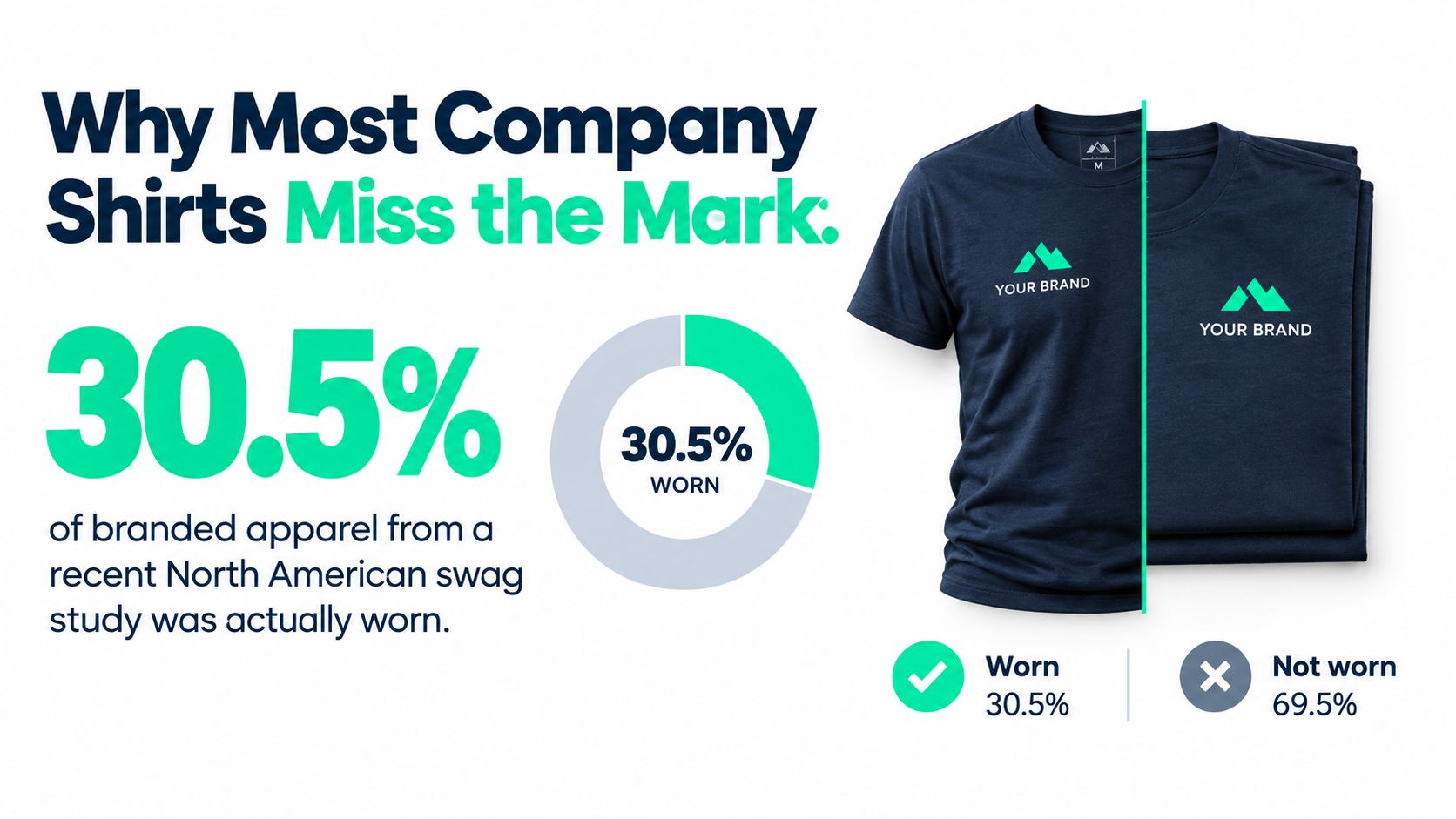
30.5% of employees said their last branded item matched what they would have chosen, and only 37.9% still used it regularly. Those figures expose the operational gap between an approved design file and a shirt that earns space in someone's wardrobe. A manager can choose a low-cost blank, place a large logo on the front, order a convenient size mix, and mistake distribution for adoption. The result is a product selected for production ease rather than wearer preference.
The same 2026 company swag study found that 77.0% preferred selecting an item from a curated company store or budgeted assortment. That preference points to a practical fix: control the choices, gather usable size information, and treat the shirt as apparel with a brand application. The design still matters, but it cannot compensate for an uncomfortable blank, poor fit, weak contrast, or an artwork file that fails in production.
The shirt has to earn its place
A company shirt competes with every other garment an employee owns. Disposable fabric, an exclusionary cut, or a print that feels too promotional can confine it to one event. The likely end point is a donation bin or discarded inventory.
Corporate buyers increasingly measure swag by use rather than novelty. A PPAI article reports that 67% of more than 1,000 corporate buyers considered swag successful only when recipients voluntarily wore or used it. 45% identified longevity as the most important feature, and 47.6% said discarded swag pushed them toward better-quality products. The operating rule is straightforward: design for an employee's next ordinary day, not only for the launch photo.
Practical rule: If the garment would make no sense without the logo, the logo is doing too much work.
Choose a blank that feels like normal apparel, match the mark to the company's visual language, and make the handoff selective enough to support fit and preference. The garment, audience, and handoff process determine whether the artwork stays in rotation.
Choosing the Right Company Shirt Strategy
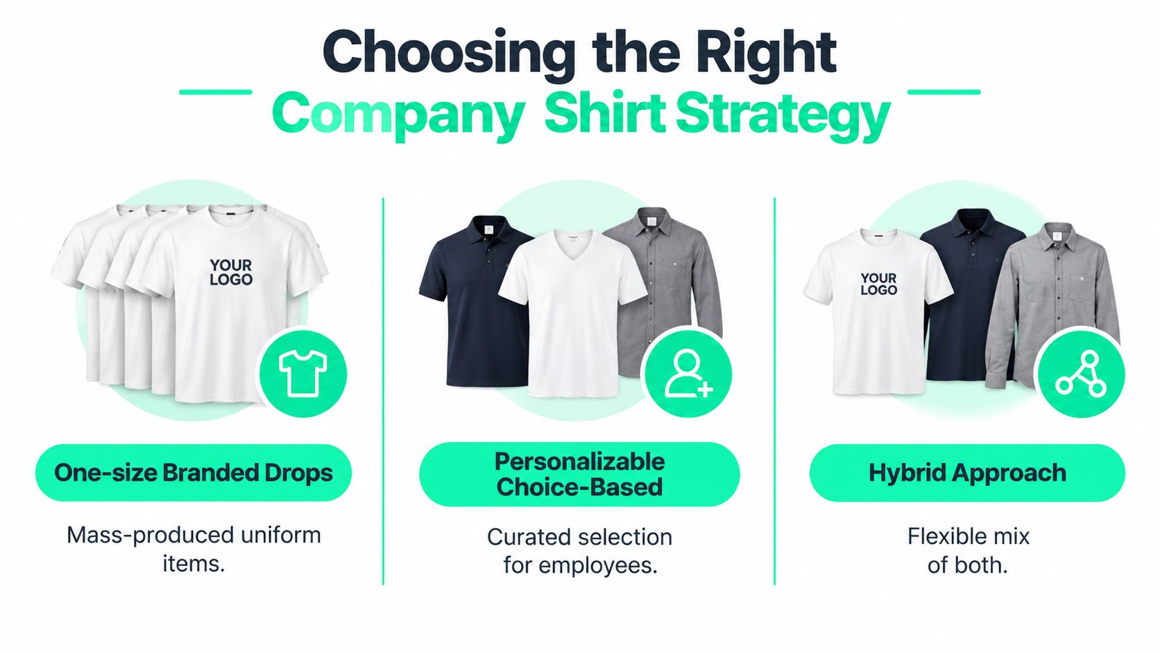
A shirt strategy should match the wearer, the moment, and the operational burden behind delivery. Three approaches work, but they solve different problems.
| Strategy | Works best for | Main strength | Common failure |
|---|---|---|---|
| Branded drop | Events, launches, field teams | Fast, cohesive distribution | Excess inventory and weak personal fit |
| Personalizable choice | Onboarding, recognition, distributed teams | Better wearer relevance | More catalog and fulfillment complexity |
| Hybrid system | Enterprises with recurring programs | Consistency with controlled choice | Poor governance can dilute the brand |
A branded drop uses one approved garment, one artwork system, and one distribution window. That keeps event logistics predictable and supports a unified team appearance at customer-facing activations or launches. The trade-off is limited wearer choice. Keep the graphic restrained and the blank broadly wearable, because a fast distribution schedule does not justify a shirt that feels disposable.
A personalizable choice program offers a curated range of garments, colors, or decoration placements. The 2026 swag research supports giving recipients controlled choice rather than assuming one product will suit everyone. This model demands better size data, catalog governance, and fulfillment planning. It can also expose operational weaknesses earlier, especially when suppliers cannot maintain consistent stock or when employees select options outside the approved brand system.
The hybrid approach suits recurring programs with several audiences. Keep a signature mark, approved palette, and shared design language, then offer controlled options such as a T-shirt, hoodie, or polo. You can also vary placement, using subtle left-chest branding for everyday wear and a larger graphic for an event. The system preserves recognition while allowing the garment to fit the occasion.
Decision test: Choose the least complex strategy that gives the intended wearer a credible reason to wear the shirt again.
Start with the use case. People Ops may need comfortable choices for onboarding. Event managers may need one coordinated shipment with predictable delivery. Marketing may need a limited graphic tied to a campaign. Define the audience, approval rules, inventory limits, and fulfillment owner before approving artwork. A polished design file cannot repair a strategy that sends the wrong shirt to the wrong people.
Selecting Garments and Materials for Everyday Wear
Artwork cannot compensate for a bad blank. Start with the physical shirt, because fabric, fit, color, and construction determine how the design feels after repeated washing and how it sits on different bodies.
For everyday employee wear, compare ring-spun cotton, open-end cotton, cotton-poly blends, and performance fabrics against the actual use case. Ring-spun yarn generally gives a smoother hand feel, while open-end construction can support a lower-cost promotional product. A blend may improve durability and moisture handling, but it can change how ink behaves and how the garment feels in warm climates.
Build a sample scorecard
Don't approve a catalog image as your final product. Order or inspect samples and record:
- Hand feel: Is the fabric comfortable against the skin, or does it feel stiff and promotional?
- Fit range: Does the cut work across the team's body shapes, and are the measurements clear?
- Color consistency: Can the supplier maintain the selected shade across dye lots?
- Shrinkage tolerance: Does the garment remain wearable after laundering?
- Seam and collar quality: Do high-contact areas keep their shape?
- Decoration compatibility: Does the intended print or embroidery suit the fabric and garment color?
Darker garments may need an underbase or a different ink strategy, and heavier fabrics can make a print feel more substantial. Lightweight performance fabric may suit outdoor work better than cotton, while a soft cotton shirt may perform better as voluntary office or community wear. The right choice depends on climate, movement, laundering, and whether the shirt is a uniform, event item, or retail-style product.
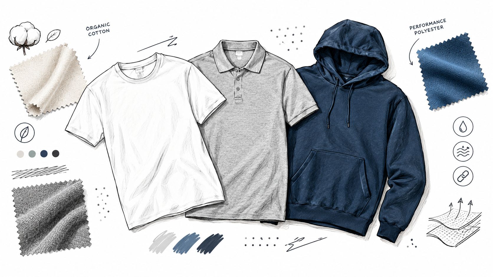
Use custom shirt examples and ink concepts when you need visual starting points, but evaluate every concept against the selected blank and decoration process. A shirt that looks strong as flat artwork may fail once seams, stretch, texture, and body movement enter the picture. For moisture-heavy environments, compare fabric behavior with this guide to custom Dri-FIT shirts.
Procurement should also look beyond a unit price. A cheaper shirt that loses shape or comfort quickly can cost more in replacements and produce more unwanted inventory. Material choice is now tied to broader apparel accountability: McKinsey's State of Fashion 2025 report states that 63% of brands were behind on 2030 decarbonization goals, while Textile Exchange's materials benchmark report notes that the share of brands with formal climate targets rose from 85% in 2023 to 88% in 2024. Ask suppliers about materials, durability, and traceability instead of accepting a vague sustainability claim.
Designing Brand-Ready Graphics That Print Well
The best screen artwork is not always the best garment artwork. A shirt moves, folds, stretches, fades under washing, and gets viewed from different distances. Design decisions must survive those conditions.
Start with the final print dimensions at 300 DPI, not with a small file that you hope to enlarge later. Export a transparent PNG for raster production or a true vector file when the artwork needs to scale across placements and sizes. Production guidance from Gearlaunch's product color and file best practices warns that upscaling a low-resolution image doesn't restore lost clarity and recommends avoiding anti-aliased edges, thin fonts, and gradients that can degrade in print.
Simplify for the decoration method
Limit the palette before the printer limits it for you. A Gearlaunch design guide reports that 47% of merchandise in its top 100 campaigns used two colors or fewer, and recommends at least 1 pt lines or 4 pixels at 300 DPI, plus 12 pt minimum text at final size, with halftones used instead of smooth gradients where appropriate. These are production benchmarks, not creative laws, but they give a useful starting point.
Screen printing rewards clear separations and controlled color counts. DTG and DTF can handle more detail, but they still need clean edges, adequate resolution, and sensible contrast. A complex illustration may look impressive on a monitor yet become muddy on textured fabric. Remove detail that doesn't improve recognition, then check the result at the actual garment size.
Use your existing logo, type system, and approved colors as constraints. A useful brand assets overview can help teams organize the source material a designer needs before adapting it for apparel. For additional direction on translating identity into clothing, review these clothing logo design ideas, then make the final decision based on print method and garment color.
Placement deserves its own proof. A left-chest mark can feel subtle and uniform-ready, while a back graphic carries more visual information but may disappear under a jacket or backpack. Sleeve and neck placements require separate checks because seams and body movement change perceived scale.
A short production lesson is useful before approval:
Validating Designs Before Full Production
A digital mockup answers whether the composition looks attractive. It doesn't answer whether the print is legible on charcoal fabric, whether the chest placement works on a larger body, or whether the ink feels appropriate for the blank. Those questions require a disciplined approval loop.
Begin with a rendered proof that shows the actual garment color, print size, placement, and available size range. Review it at normal viewing distance, then zoom in only to inspect file defects. If the artwork only works when enlarged on a laptop, it isn't ready for a shirt.
Use a small, controlled review group
Collect feedback from people who represent the intended wearers, not every stakeholder with access to the project. Ask specific questions:
- Can you identify the brand quickly?
- Would you wear this outside a required event?
- Does the print remain readable on the chosen garment?
- Does the cut and color feel appropriate for the climate and setting?
- Is any text too small, decorative, or easy to misread?
A physical sample is the decisive test. Inspect ink coverage, registration, edge sharpness, fabric show-through, collar alignment, and how the design sits when the shirt is worn. A small sample run costs less than discovering a color, placement, or sizing error after bulk production. Use an apparel mockup generator for early comparisons, but don't confuse a mockup with a production proof.
Lock the pre-production record
Approve one consolidated set of specifications:
- Artwork files: Confirm the final PNG or vector assets and transparent background.
- Color references: Record garment color, ink colors, and any underbase requirements.
- Placement notes: Specify print zone, dimensions, and how placement changes by garment size.
- Size distribution: Use collected preferences where possible rather than guessing.
- Decoration method: Confirm screen printing, DTG, DTF, embroidery, or another selected process.
- Delivery details: Confirm the destination, packaging, deadline, and approval owner.
Approval discipline: One named owner should sign the final proof. Shared responsibility is how spelling errors, outdated logos, and conflicting placement instructions reach production.
Real Company Shirt Scenarios and How to Adapt Them
An onboarding shirt and an event shirt may share the same logo, but they shouldn't automatically share the same product decision.
For new-hire kits, the shirt is part of a welcome experience. A soft blank, restrained mark, and optional color choice make it feel like personal apparel rather than a uniform. Keep the design system recognizable, but let the employee choose among approved garments or placements where fulfillment allows.
For recognition awards, the shirt can carry more personal meaning. Use a small signature mark with a specific approved phrase, team identifier, or milestone treatment, but keep the rest of the garment versatile. The recipient should be able to wear it at work, at home, or in a social setting without feeling as though they're wearing an advertisement.
An international event drop introduces different constraints. A dark garment may need a different ink treatment than a light one, climate may favor a lighter or moisture-managing fabric, and a slogan or illustration may not travel cleanly across cultures. Keep the core logo and brand palette consistent, then adapt the supporting graphic, garment type, and placement by region.
One system, several executions
| Situation | Keep consistent | Adapt locally |
|---|---|---|
| Onboarding | Logo, type, approved colors | Blank, fit, employee choice |
| Recognition | Brand mark and quality standard | Message, placement, edition details |
| Global event | Core identity and file controls | Fabric, climate, language, cultural references |
Avoid putting every regional preference into one global shirt. That often produces a crowded compromise that nobody loves. A controlled family of designs works better: shared visual rules, with enough flexibility for the people and setting receiving the garment.
The same principle applies to matching light and dark blanks. Prepare separate artwork versions rather than forcing one file to work everywhere. Check contrast, underbase needs, and perceived print weight on each color before approval.
Practical Next Steps for a Stronger Shirt Program
Start by auditing the shirts already in circulation. Ask employees which garments they still wear, which fit poorly, which prints failed, and which designs they would choose again. Review return, replacement, donation, and leftover patterns qualitatively if exact tracking isn't available.
Then reduce the blank library to a manageable set. Keep a dependable everyday T-shirt, a warmer layer, and a polished option where the audience needs one. Test each garment physically, document its fit and decoration limits, and reuse proven blanks instead of restarting procurement for every campaign.
Assign the next move by role
- People Ops: Offer controlled garment choice for onboarding and recognition, then collect fit and wear feedback.
- Marketing: Build a small family of print-ready graphics with approved light and dark garment versions.
- Events: Order a physical proof early and confirm delivery, size collection, packaging, and regional requirements.
- Procurement: Evaluate quality, material information, repeatability, and total program waste alongside price.
Track the signals that matter: voluntary wear, repeat requests, replacement needs, and unused inventory. Sustainability should be operational, not decorative. Proven employee incentives can help People teams connect merchandise with broader recognition planning, but the shirt still has to deliver comfort and usefulness on its own.
A strong program becomes a repeatable cycle: choose the audience, select the garment, simplify the art, proof the physical product, distribute with context, and learn from actual wear. That process produces better company shirt design ideas because it measures success in rotation, not approval applause.
FLYP LTD helps enterprise teams turn brand inputs into production-ready apparel designs, curate suitable blanks, and manage QA, fulfillment, and employee-choice programs. If you need a more reliable way to move from company shirt design ideas to wearable drops, visit FLYP LTD to explore the platform and managed merch services.