You have a logo file, a shipping date, and a rough headcount. Someone in procurement has already asked which print method you want, and a printer has asked which garment the artwork will land on. Neither question has a useful answer yet, because the decisions that determine whether the shirt looks right arrive in a different order.
Most guides to how to get a design on a shirt start with the printing press or the art file. That sequence produces gorgeous mockups and disappointing garments. The workable order is method, then garment and ink, then rights, then files, then proof. Get the first three wrong and no amount of retouching saves the run.
Table of Contents
- Choose the Print Method Before You Design
- Match the Design to the Garment and Ink
- Clear Rights Before Your Design Goes on a Shirt
- Prepare Artwork Files That Print Cleanly
- Approve a Proof and Test Durability
- Send Your Brief and Start Your Order
Choose the Print Method Before You Design
The table below settles the first decision. Read it by run size and by artwork, not by whatever a printer happens to have loaded that week.
| Method | Best for | Setup needed | Run size fit |
|---|---|---|---|
| Screen printing | One to three colors on a repeatable graphic | One screen per color | Large runs |
| DTG (direct-to-garment) | Photographic detail, gradients, full color | No screens; dark garments need pretreatment | Small batches and one-off launches |
| DTF (direct-to-film) | Full-color artwork on cotton, polyester, nylon and blends | Film transfer, no screens | Short runs and mixed-fabric orders |
| Heat-transfer vinyl | Simple cut shapes in a few colors | Cut vinyl and heat press | Very small runs |
| Sublimation | Light-colored polyester and all-over prints | No screens; no white ink | Any run, light polyester only |
Screen printing earns its place on repeatable graphics because the screen cost is spread across every shirt in the run. DTG skips screens altogether, so a photograph with a thousand colors costs the same to print as one spot color. DTF takes full-color artwork onto a film that bonds to cotton, polyester, nylon and blends, which suits a program where the same logo lands on a hoodie and a performance polo. Heat-transfer vinyl cuts colored shapes from a roll, fine for a prototype and wrong for a 400-piece onboarding kit. Sublimation dyes light polyester and can't lay down white ink, so it rules itself out of a navy tee.
Answer three questions before you open a design file: how many shirts, how many ink colors, and whether the artwork is photographic. Write the answers down and carry them into the proof stage.
Volume explains why screen printing still dominates. Global printed-textile output is estimated at more than 27 billion square meters annually, while digitally printed textiles account for about 500 million square meters, roughly 1.8% of the total in the cited industry estimate, according to a Theseus study on digital textile printing. Conventional rotary screen printing can exceed 1,000 square meters per hour, against roughly 2 to 150 square meters per hour reported for commercial digital inkjet textile printers.
Those figures describe machines, not your order. A 40-shirt run with a five-color logo doesn't justify five screens if a DTG print survives the wash test. A 900-shirt event where every garment carries the same two-color crest does, and the per-unit cost drops with each shirt added. The method also dictates what your files must look like, so settle it before anyone opens Illustrator. If you're weighing outsourced production against doing it in-house, this breakdown of on-demand apparel printing covers how minimums and pricing shift between the two.
Match the Design to the Garment and Ink
One artwork does not mean one production treatment. Fabric and garment color decide as much as the method does, and the difference is easiest to see on cotton next to a polyester blend.
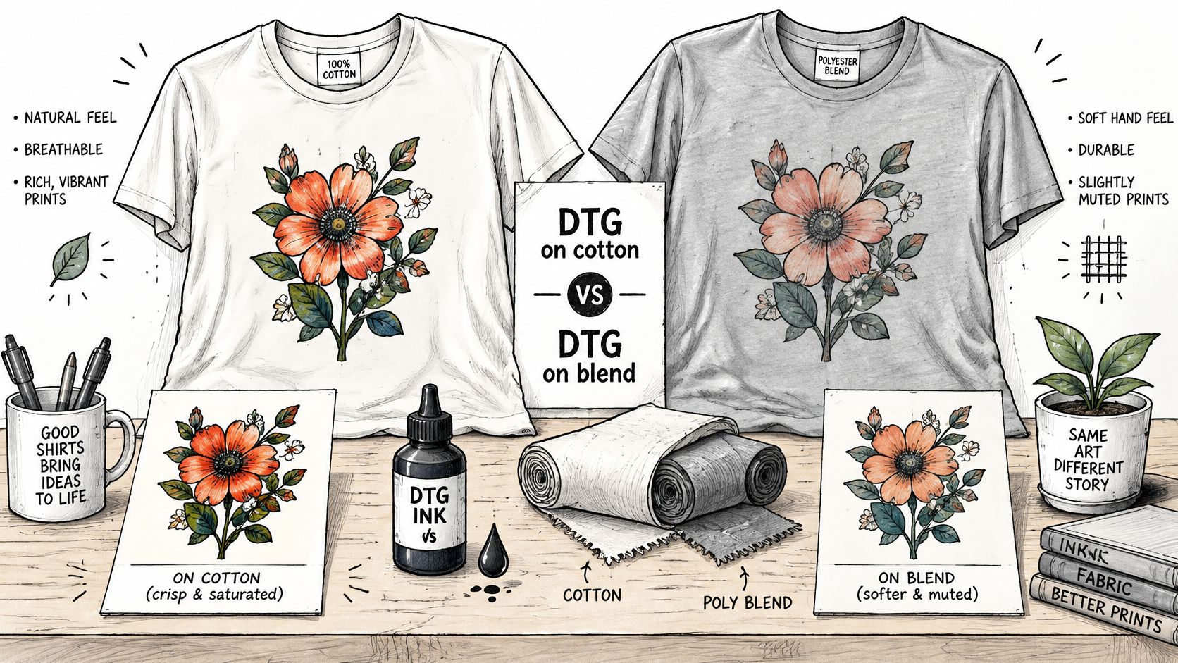
DTG is generally strongest on cotton and less predictable on polyester or blends, according to Shopify's guide to designing a shirt. Dark garments need pretreatment before the ink sits properly, and sublimation is confined to light-colored polyester because it cannot apply white ink. DTF reaches across cotton, polyester, nylon and blends, but the transferred film can feel thicker against the skin than ink absorbed into the fiber, which matters on a shirt people will wear against their neck.
A worked example. Say a company orders welcome kits for offices in three countries: navy cotton hoodies, white polyester polos for a customer-facing team, and a light heather tri-blend tee for a hackathon. One logo, three blanks, three treatments. The hoodie wants embroidery or a DTF transfer that holds on dark cotton. The white polyester polo is the one spot where sublimation works, and also the spot where a DTG print risks looking washed out. The tri-blend needs a soft-hand print so the shirt doesn't feel like a billboard.
Practical rule: the best method isn't set by order size or image complexity. It's set by artwork, fiber content, garment color and what the wearer expects to feel.
Three actions follow. Request a proof on every blank in the program, not just the cheapest one. Compare print texture and wash performance side by side rather than judging from a photo. Then write down an acceptable color deviation before the large order goes in, so nobody argues about a two-shade shift after 600 shirts land.
The blank itself sets the ceiling on all of this, since a heavyweight ring-spun cotton and a lightweight performance knit take ink differently even under the same press settings. Choosing among the best premium blank t-shirts before the artwork is final saves a rebuild later.
Clear Rights Before Your Design Goes on a Shirt
A clean PNG is a file. It isn't a licence. Exporting a transparent background at the right size answers nothing about whether you can sell the shirt, distribute it in three countries, or stop a competitor from printing something similar.
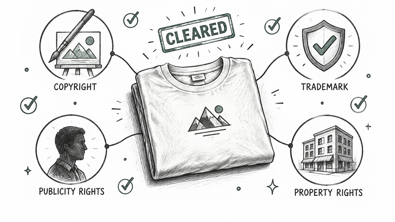
Four separate rights sit under a single design. Copyright covers the artwork itself. Trademark covers logos, names and anything that signals a source to buyers. Publicity rights cover any recognizable person, including your own employee photographed at a team offsite. Licensed third-party material covers fonts, stock images, characters and anything you didn't make.
The AI question complicates this further. The American Bar Association's analysis of AI and fashion's public domain notes that AI-generated fashion designs can have limited copyright enforceability, while protection is stronger where a human's creative selection, arrangement or modification remains perceptible. In practice, AI accelerates ideation without guaranteeing exclusivity.
- Log the human contribution: keep dated records of the edits, arrangements and selections a person made, so the claim to protection rests on something visible.
- Save prompts and outputs: if a design was generated, the prompts and versions are evidence of how it came about.
- Screen for protected references: check outputs for recognizable brands, characters, logos and the signature style of a living artist before the file reaches a printer.
- Get approval in writing: commercial use needs a documented yes, whether from a licensor, a photographer or the person whose face appears in the artwork.
For enterprise swag, the risks are mundane and real: an employee's photo used without a release, a slogan that breaks a regional brand rule, a typeface licensed for web only. For creators, a design that looks original can still resemble protected trade dress. Clearance is a pre-production gate, and it sits earlier than the proof. If a freelancer built the artwork, settle who owns your freelancer's deliverables before the print run rather than after a successful launch.
Prepare Artwork Files That Print Cleanly
A file that looks sharp at 400% zoom on a monitor can still print soft, because a monitor has no fabric to absorb ink. File preparation is a sequence, and each step exists to prevent a specific failure downstream.
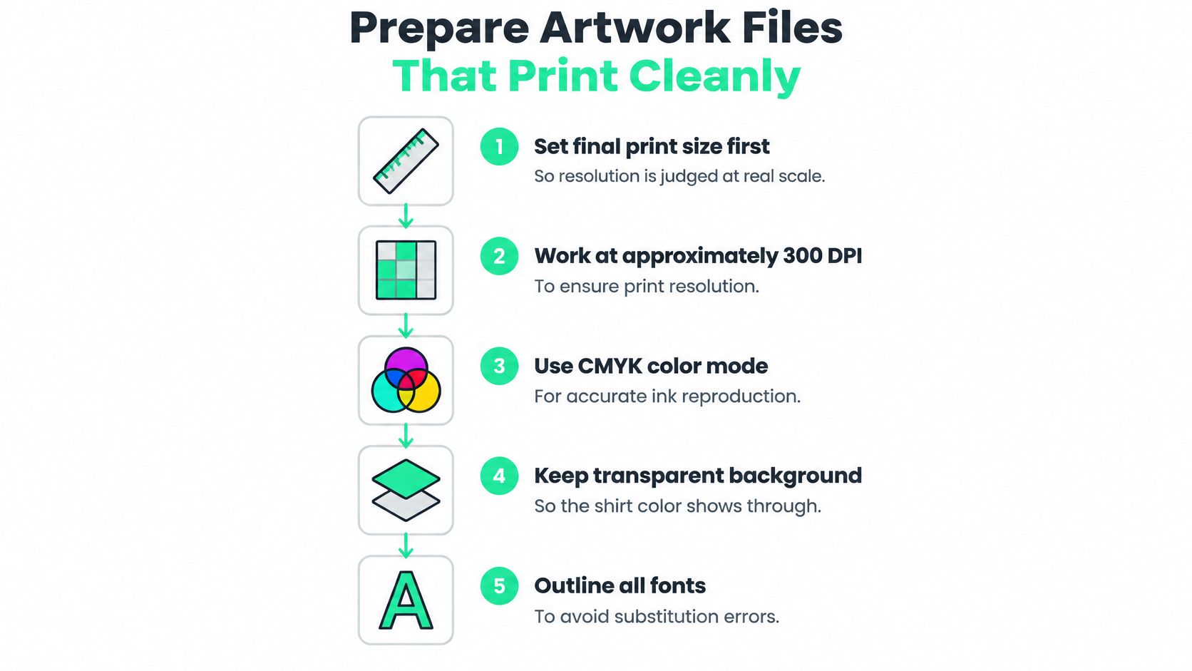
- Set final print size first. Resolution is only meaningful at real scale. A chest graphic set at 3 inches wide needs far fewer pixels than the same art scaled to 11 inches across the back.
- Work at roughly 150 to 300 DPI at that final size. The digital textile printing guide from Wave PLM recommends preparing artwork at approximately 150-300 DPI at final print size, and low-resolution raster art is the most common cause of ragged edges on a finished shirt.
- Convert color through the printer's ICC profile. RGB on a screen generally covers a wider gamut than textile pigment systems, so an unprofiled mockup shifts once printed. Same guide, same warning, and it's the reason a green that looks right on a laptop turns mint on cotton.
- Separate colors for screen printing. One layer per ink, named clearly, because each color needs its own screen and a missed separation becomes a missing color on 500 shirts.
- Write a one-page tech pack. Garment substrate, placement, dimensions, ink system and wash-fastness requirement all belong in it, so the printer isn't guessing from a file name.
- Check placement against the actual garment size. A collar-to-chest measurement from a generic size chart is how a logo ends up under a hoodie pocket.
Four pitfalls account for most reprints: RGB export without conversion, low-resolution raster art, skipped pretreatment on dark garments, and placement approved from a size chart rather than a real shirt. A ready file is a vector or a high-resolution PNG at final size, a named color profile, and a tech pack short enough that someone reads it.
Here is the production side of the same process, if you want to hear how a shop checks calibration and color drift during a run.
Approve a Proof and Test Durability
Approval starts with a physical strike-off on the actual garment, checked against calibrated color references. An on-screen preview is only a rendering, and a printer who offers it as the proof is transferring risk onto your budget.
A strike-off costs one blank and one press cycle.
Once production starts, the failure modes are visible if you look: banding, head strikes, registration errors and color drift measured with a spectrophotometer. Standard practice is to finish with wash-fastness testing such as ISO 105-C06 or an equivalent standard, plus rub-fastness and dimensional-stability checks.
Durability expectations differ sharply by method. Wash temperature, detergent, curing, fabric and artwork coverage all move the result, so the figures below are orientation for planning rather than a promise.
| Method | Indicative washes before visible wear | Main sensitivity |
|---|---|---|
| Screen printing | Roughly 1,000 or more | Curing and ink deposition |
| DTG | About 40 to 50 | Pretreatment and wash temperature |
| Heat-transfer vinyl | About 20 to 30 before cracking becomes likely | Heat-press settings and detergent |
Apparel-printing durability guidance summarized by Garment Eched places screen printing at roughly 1,000 or more washes under suitable conditions, DTG at about 40 to 50, and heat-transfer vinyl at approximately 20 to 30. That gap is why vinyl suits one-off prototypes and very small runs, while production apparel calls for a method that survives regular laundering.
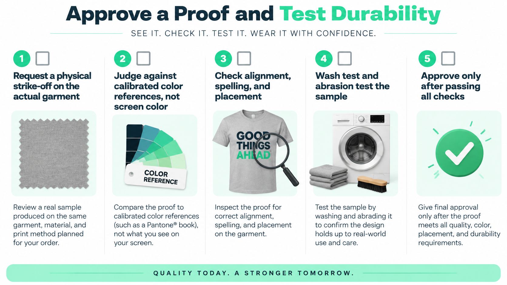
The test sequence is short enough to run on every program. Wash the sample at the temperature the wearer will use, for the number of cycles that matters to the program. Run the wash-fastness standard, then rub-fastness and dimensional stability. Compare the washed sample against the approved strike-off, and let the comparison decide whether you scale.
What actually fails: insufficient curing or fixation, excessive ink, poor pretreatment and wrong heat-press settings. Each produces fading, peeling or cracking that looks like a bad method when it is really a bad setting.
Validate with a representative sample before scaling any drop. If your quality bar needs a written form, these apparel quality standards give you a checklist to hold a supplier to.
Send Your Brief and Start Your Order
Your sequence is now fixed, in this order because each decision constrains the next: choose the method from the run size and artwork, check the garment and ink match for every blank, clear the rights, prepare files against a tech pack, approve a garment-specific strike-off, and test before scaling. Skip a step and you find out about it in a photo of a cracked logo.
The first action is gathering what the design starts from. A brand URL, a logo file, a style guide or a short written brief is enough to begin. Send that alongside the run size, the ink colors, and the garment preferences: a garment-dyed heavyweight tee with a full-colour chest graphic for a launch run, or polos for the customer-facing team.
Ask for one thing before you approve anything: a garment-specific proof on each blank in the program. A pressed sample on the real garment shows ink coverage, hand feel and how the print sits in the fabric's texture; a digital mockup confirms placement and scale and nothing more.
At FLYP LTD, we turn those inputs into a merch collection and store. The AI picks each garment from 600+ blanks and generates production-ready designs, typically in under a minute, so your team reviews proofs and approvals instead of chasing each vendor step.
FLYP LTD scopes every program against its decoration defaults, then handles production, delivery and support as one managed service. Visit FLYP LTD and send your brief with run size, colors and garment preferences to get started.